
The competition was tough this year, but we’ve been able to whittle our selection down to ten. These album covers made us want to hear the music, and even if the music wasn’t much good (don’t worry, it was), we still wanted a copy of the art, preferably on vinyl. In the old days, we’d bring these albums to school to show our friends; we’d debate over the meanings and metaphors, and commit the images to memory. Thankfully we can do that today with our phones, with no risk to the records. And now, A Closer Listen presents The Best Album Covers of 2019!
The above image is taken from the John Peele Center for Creative Arts via The Suffolk Guide.
Black to Comm ~ Seven Horses for Seven Kings (Thrill Jockey)
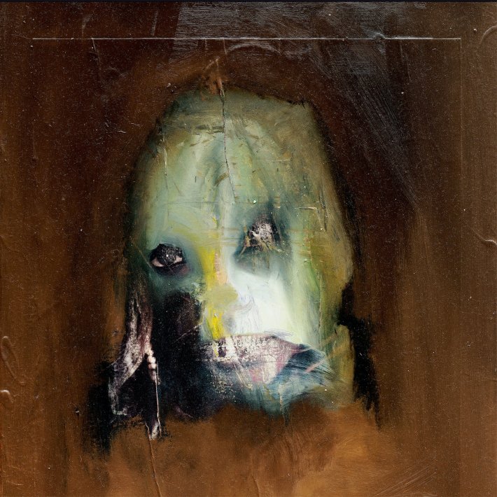
Andreas Diefenbach‘s cover art is an “overpainting of a famous TV personality,” reminiscent of the band Slipknot and signifying the dark nature of the music found within. Of all the covers in this year’s list, it’s the most likely to be called iconic. The right eye is the more frightening of the two, but the left has been scratched out, as if subject to Stalin’s campaign of omission ~ a chilling trend that finds new reflection in the era of post-truth.
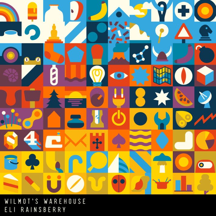
Richard Hogg‘s art for Wilmot’s Warehouse bursts with color and creates immediate interest in the video game and the music. The project is described as “a game for people who like to organize stuff,” and this image is perfectly organized, descending from blue to orange. One wants to know more about every little aspect ~ and wouldn’t this series of squares be great as a set of actual, real-world blocks?
Richard Hogg:
All of the artwork on the Wilmots Warehouse soundtrack covers is just art from the game. Technically it would even be possible for a player to recreate the cover in-game by arranging the products in their warehouse. When Eli asked me to do the cover I wanted to make something that was honest and true to the game, but I also wanted to make something a bit different and that hopefully had a lyricism and a richness to it that reflected how I felt about the music. I think it might be my favorite bit of Wilmots Warehouse art, an honour it shares with the Hohokum soundtrack art, easily my favorite thing that I made for that game.
Eli Rainsberry:
Even though I’ve seen a lot of his art throughout the game beforehand, being able to work with Dick on the album artwork was a sweet experience. I had a feeling that something fairly minimal, but expressive in a way that helped convey how I felt about my sounds, and what impression that could give to others, would be effective – I think we were both on the same page with that! So I simply asked to have something based entirely on the tiles, but I also allowed more freedom with curating the tiles and colour palette, and any other things that would be important to express, such as how Dick felt about the music and game, too. The outcome was really satisfying, and I think the design balanced out to show something that both of us would be really content with, as well as summarising what I composed for the game a little too accurately.
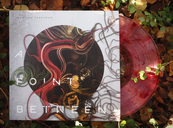
Floating Spectrum ~ A Point Between (Temporary Residence)
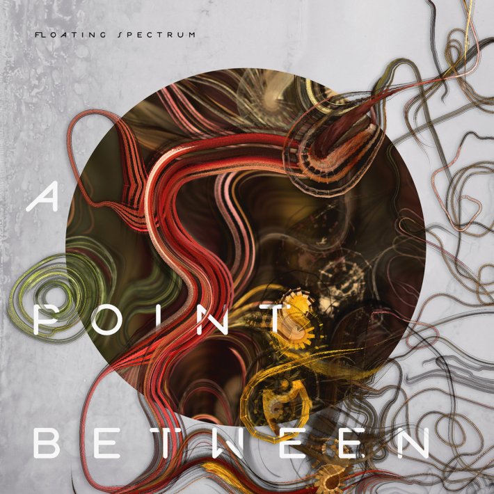
The album was inspired by a dance performance, was translated into music, and inspired the beguiling cover image by Abe Pazos. The tendrils represent hair and synthesizer cords, while the swirls suggest paint: an apt combination of images for Mei-Fang Liau’s debut album. On the vinyl edition, red swirls are found on the record as well. The art ~ as well as the music ~ exists at a point between.
The album is inspired by the cyclical nature and explores themes of growth and decay. I wanted the album artwork to be the visual representation of the core inspiration and the sound palette. Abe’s approach of combining colors from nature and his custom generative tool turned out to be a great match! The designer Federico Basile gave a final touch to the artwork by trimming it to a circular shape, which highlighted the concept and made the individual elements appear more alive.
Producing the artwork was both a physical and a mind journey. Physical, because my body was surrounded by a new unknown world to me: South Taiwan, with its inspiring forms, tastes and smells. And a mind journey because I had no clear vision of what I was going to create, only a direction that involved growth, decay and the organic. The way I create is by writing computer programs that help me produce still and moving images. I spent weeks jumping between writing a painting software and using it to paint possible album covers. During one of our walks in the forest we suddenly came up with the idea of collecting fallen plant leaves in different states of decay and sorting them to create a color palette, which was the missing breakthrough that lead to the cover you can see in the album. You can read a more detailed post here.
Lilien Rosarian ~ a day in bel bruit (Self-Released)
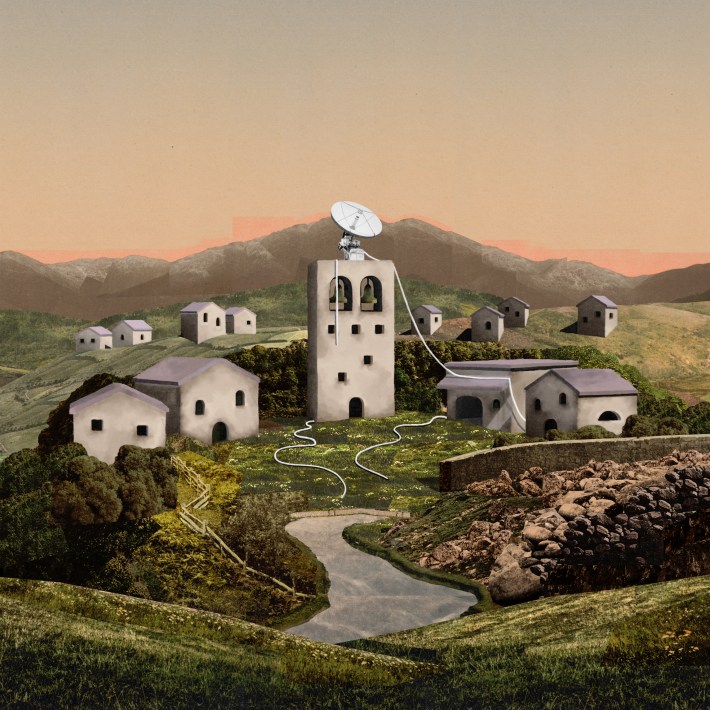
a day in bel bruit is a family affair, as one sibling is responsible for the music and the other (Corey Abel) the fantastical cover art. The image is a perfect reflection of the theme: an abandoned village “where radio sounds now replace those of the residents.” After hearing the music, one is unable to stare at the cover without hearing the sounds: a seamless combination of audio and visual.
Lilien Rosarian:
The cover is an amalgamation of many bits and pieces of old colorized photos, rearranged to form the landscape of Bel Bruit. The method was influenced by some of Petra Cortright’s artworks of looping, fragmented landscapes; we wanted the world to mimic the glitchy, repetitive nature of the sounds that emanated from it.
Manja Ristić ~ The Black Isle (Flag Day Recordings)
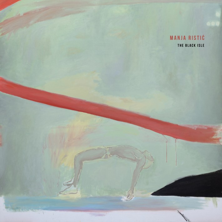
It’s rare for albums of field recordings to possess such evocative covers, but The Black Isle bucks the trend. This particular piece comes from the series Strange Waves, by Simonida Rajčević. The red line and submerged figure represent the hydroponic nature of the set, as well as a connection with memory and surrender. The Black Isle appears to the bottom right, nudging its way into the mind and frame.
The whole idea of the exhibition Strange waves is to explore the sense of passivity and helplessness of individuals in society, of bodies that are both exposed and sensitive, as well as the possibility to use those feelings to turn them into their opposites. Human transcendence and overcoming, being surrounded by abstract landscapes against which the body seems small and vulnerable, especially considering the format it’s set in. It’s an inclusive and safe space, but on the other hand it’s also no man’s land, a two-dimensional surface with limits and encounters of space and volume.
The Phonometrician ~ Mnemosyne (Lost Tribe Sound)
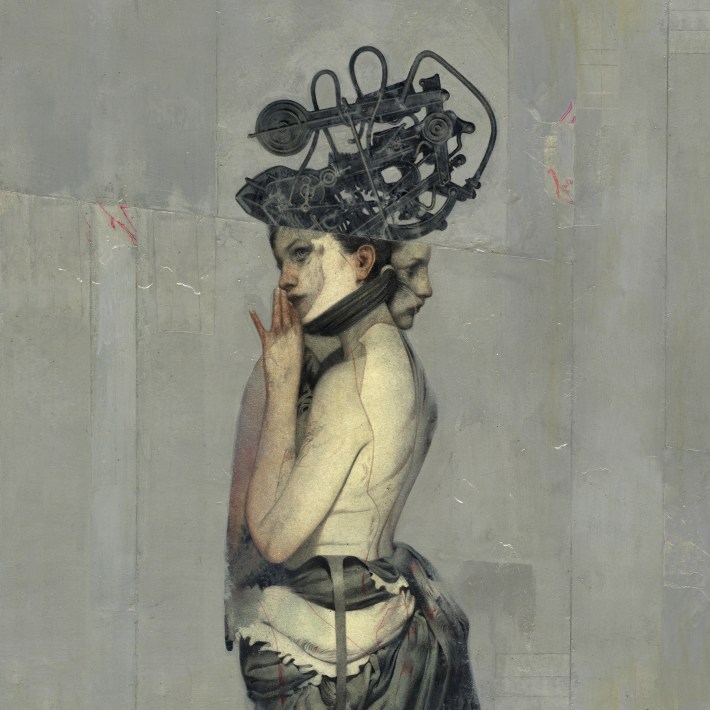
The popularity of HBO’s His Dark Materials has brought new attention to the beloved steampunk genre, the bread and butter of artists such as São Paulo’s João Ruas. The cover is only part of the illustration, and even more of the artist’s art graces the inside of Mnemosyne. An unusual album demands unusual art, and in this case the two have found a fitting match.
Polynation ~ Igneous (Atomnation)
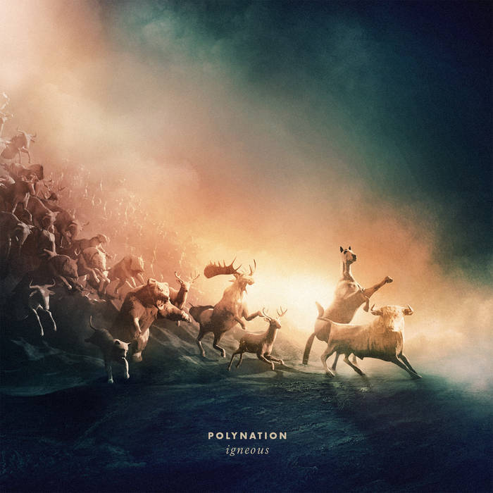
We knew it right from the start: this album cover was going to make our list. Producer, drummer and graphic artist Hessel Stuut has produced a masterpiece, but in order to appreciate it, one must view it large. Everything here is exquisite, from lighting to design, a brilliant advertisement for a dramatic album. For even more sheer, muscular detail, see the art for the Toba single below.
Polynation:
The animals are 3d renders, inspired on classical paintings from Delacroix (La Liberté guidant le peuple) and landscapes from William Turner. We liked the idea of this stampede of wild beasts fleeing from a vulcanic eruption – becoming petrified in the process. Igneous has this as a concept in mind: on the verge of apocalypse, examining the different atmospheres and feelings of letting go, mourning, euphoria, and melancholy.
Skyphone ~ Marsh Drones (Lost Tribe Sound)
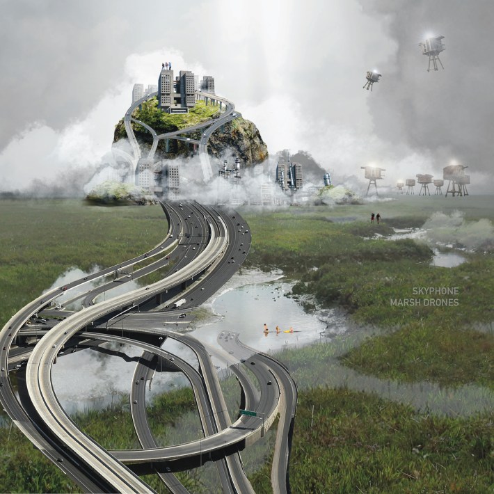
After seeing the amazing design for Hildur (re-issued alongside the current release), Skyphone and Lost Tribe Sound called on Martin Sønderlev Christensen again for the follow-up. This incredible hybrid of nature and technology finds foothold on the album as well. The neatest detail is the family wading across the marsh ~ just as one wades into this music and art.
WaqWaq Kingom ~ Essaka Hoisa (Phantom Limb)
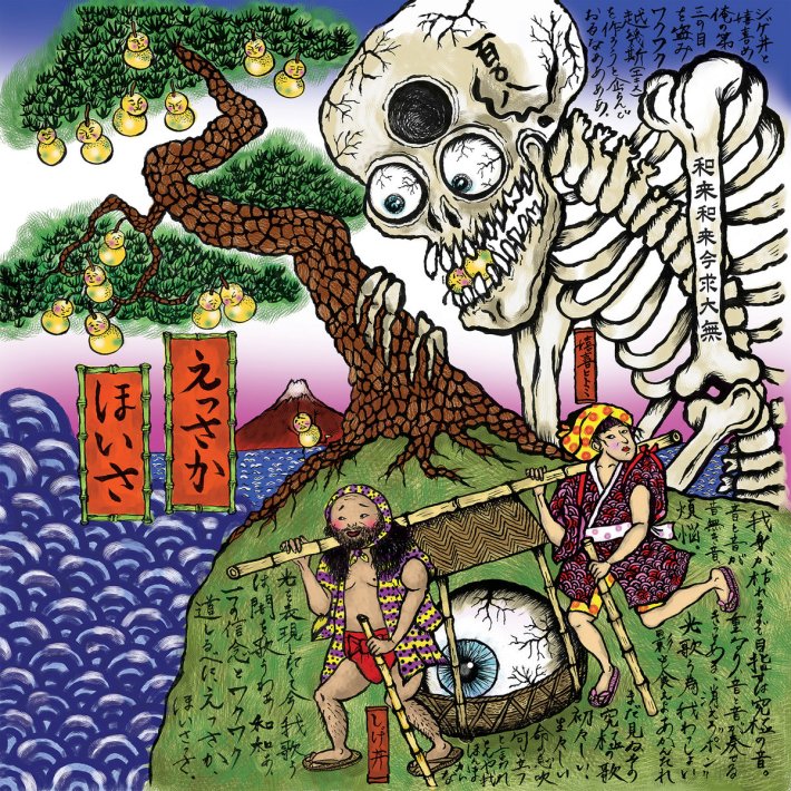
That is one crazy cover, and yes ~ those are indeed the two artists in the frame, running from a three-eyed skeleton who has lost his middle eye. Kiki Hitomi may be known for her work with King Midas sound, but now she’s in a new duo that is benefitting from her art as well. The image simultaneously honors and comments upon kago folklore ~ now we are all part of the myth. The music is similarly serrated, a blend of styles from Shinto to Atari.
Kiki Hitomi:
The last song I recorded with my vocals was Hototogisu on our new album Essaka Hoisa. I wrote this lyric all in Japanese, one of the songs, Hototogisu says “一つの信念とワクワク、道しるべにえっさかほいさっさー”, make one true believe and waqwaq (passion and exciting feeling in Japanese) into the guide or sign post to reach the destination on ‘Essaka Hoisa’ journey of life. Essaka Hoisa in Japanese is a kind of sound we say when we are on the run or making effort and working hard to the distinction. During the Edo period, Japanese people carry heavy stuff or a human in Kago (basket carrier to transport people) with two people or more people, they need to keep the harmony to carry on, and so they shout “essaka hoisa”. The carrier people are saying to encourage themselves to get going on their hard work as an almost rhythmical way. This shouting is also good at keeping their spirits lifted; therefore they can keep going even when carrying heavy Mikoshi, important dignitaries or other stuff for miles.
I wanted to draw the cover with Japanese ukiyoe style. I love Hokusai and Kuniyoshi Ukiyoe style, the motif and concept. I especially love Ukiyoe Manga which is the real original of Japanese manga that developed in Edo period in Japan. It’s Ukiyoe but there are letters as description and conversation of the characters in the Ukiyoe. So I took the Ukiyoe Manga style in the cover! I wanted say that life is the training journey to be better soul dropping 108 ego that based on Buddist philosophy. But you do that not alone and you learn many things with and from others. On the album cover, me and DJ Scotch Egg are carrying a 3rd eye ball which represents ultimate justice and truth stealing from the giant skeleton with tattooed number 108 in Chinese characters. I drew Ukiyoe style wave… wave represent uneasy life. Life is like a wild wave in ocean; they keep coming and coming. Apparently in old Turkish or Arabic story there is WaqWaq island and on the island there are tree growing with fruits have faces! So I drew them on the cover but I made a pine tree which you can see them often on Ukiyoe motife.
Yodok III ~ This Earth We Walk Upon (Consouling Sounds)
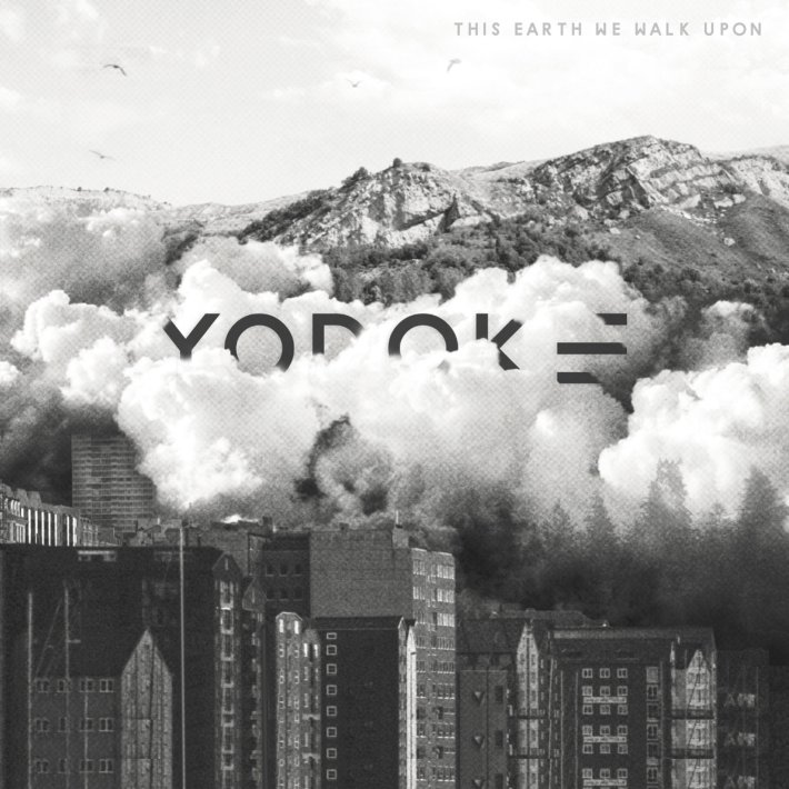
No, this disaster didn’t actually occur ~ cover artist Juliane Schütz created the image by combining parts of ten photographs taken around the globe. This is the top half of the full image in the foldout, but we prefer it as is, with the emphasis on the smoke. The single-track, 63-minute album builds in timbre from fog to fire. The image is a teaser, but it’s also a coming attraction.
The challenge is to align that setting’s ingrown rules and convictions with your own. When do convictions become restrictions?
Treading farther, you discover a startling gap between what’s being presented to you and what hides behind the masquerade. Pretentiousness seems to outgrow integrity. How else do you make yourself heard when everyone around you is screaming? What parts will you manifest into your own identity to get along, and what parts of yourself are you willing to reveal in return?
When force majeure ruthlessly tears down all walls without a warning, you find yourself placed into a foreign setting with your ingrown mindset of beliefs, rituals, habits and patterns.
Richard Allen
