
 Album covers were never more important than they are today. In the old days, one might peruse the bins at the local record store, seeing if something caught the eye and hopefully the ear. Now most people buy their music online after scrolling through hundreds of images and short descriptions. Without name brand recognition, a generic cover has no chance.
The best album covers make us want to hear what is inside. They signal that an artist is a maverick, an originator, an auteur. If someone has paid this much attention to the art, the music must be worth hearing, if only to satisfy our curiosity. The ten releases below back up visual art with aural treasure. Together, they represent 2021’s best pairings of sight and sound.
Aries Mond ~ Gaps and Shortcuts (Self-Released)
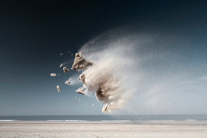
Artist: Claire Droppert, “Gravity and Sand Creatures ~ Goat 5”
We fell in love with this image the moment we saw it. Rotterdam photographer Claire Droppert has produced an entire series of this ephemeral creatures, whose beauty is in the breaking apart. The same holds true for Aries Mond’s music, which splices and cuts to create unexpected vistas.
From Aries Mond:
In visual arts, I usually enjoy what we could call « illusion arts », especially when we don’t know exactly how things are done. I sometimes work on sound this way and it was the case on my last album. I discovered Claire Droppert’s « sand creatures » while I was trying to get the very first tracks of my last album together. I had these sounds of weird strings, animals, heart beats, and I think this supernatural sand totem helped me to make a link between all these sounds. I remember I immediately loved these sand creatures, perhaps because we don’t know exactly what we see and what it tells. The image seems to be very immediate and complex in the same time. So I contacted Claire Droppert and it was really cool from her to allow me to use her personal work. Now, I still wonder how she did this crazy image …
Explosions in the Sky ~ Big Bend (An Original Soundtrack for Public Television) (Temporary Residence)
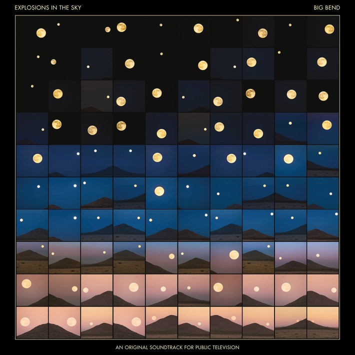
Artist: E. Dan Klepper, “one hundred moons”
We chose this image because it looks exactly like explosions in the sky, as well as representing the vistas of Big Bend. What we didn’t know was that the band had chosen the most perfect artist ever. E. Dan Klepper has been producing mosaics and photographs of Big Bend art for decades, with an obvious love for his subject. Dozens of images on his site would make great album covers!
From E. Dan Klepper:
100 Moons, a unified sequence of one hundred photographs, captures the rising full moon over the desert grasslands of Big Bend in far west Texas. Visual artist and photographer E. Dan Klepper photographed the sequence when the lunar planet was closest to Earth, an event known as a supermoon. The dreamy, mesmerizing image caught the eye of post-rock band “Explosions in the Sky” in their search for the face of the soundtrack Big Bend, their melodious odyssey through Big Bend country.
“It was surprise, praise and gratitude all in one,” Klepper says of his reaction when he was contacted by the band’s agent. For the past 20 years, the visual artist has resided north of Big Bend National Park in Marathon, Texas. His renowned large-scale photo mosaics, sculptures and experimental videos carry a unique juxtaposition of subject matter rooted in the wild, untamed landscape of rural Texas, crafted with high-tech tools and methods.
“Many of my images are a kind of meditation on time, unfolding in the landscape from seconds to hours to centuries,” Klepper says. “100 Moons is the genesis for the exploration of those kinds of ideas in my work.”
Born and raised in Texas, Klepper earned his Bachelor of Arts at the University of North Texas, completing his coursework with an introduction to experimental video technology, part of the discipline known as time arts, courtesy of California video artist and visiting professor David Dowe. Klepper’s enthusiasm for technology sent him to Chicago, center of a burgeoning time arts scene, where he was selected for the School of the Art Institute’s experimental video department. With the assistance of a work/study program, Klepper completed his master’s degree in the video arts at the Institute, then continued to create works through arts council grants and support from the non-profit media organization The Center for New Television. Throughout the 1980s and early 90s, Klepper experimental video works were represented and distributed by the Video Databank, Chicago.
Since returning to Texas, Klepper has continued his exploration of innovative technologies, often applying them to traditional art-making processes like photography, painting and sculpture. Today, his work is represented by Foltz Fine Art in Houston and can be found at his gallery and studio in Marathon and online at www.kleppergallery.com.
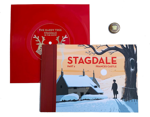
The Hardy Tree ~ Stagdale Pt. 2 (Clay Pipe Music)
Artwork: Frances Castle
The entire Clay Pipe collection bears the signature stamp of Frances Castle, who is now branching out into the field of graphic novels. The cover image tells the story without words: a young man pauses in front of an inviting house, but he does not go in. Why not? Where has he come from, and why is he afraid of what lies ahead? You’ll have to read the story to learn more.
From Frances Castle:
Stagdale is the second part of my graphic novel based around life in an isolated English village – the story spans two generations; from World War Two to the Nineteen Seventies. The second part centers around Max, and the story and the music that goes with it, tell how he escaped Nazi occupied Berlin on the Kindertransport. Most of the book is set in Berlin and on the train journey that he takes across Europe, it is only on the very last page that you see him arriving in Stagdale. I wanted the cover to tell part of the story, so you see Max standing out side the same cottage that played a prominent part in the first book. It gives a little bit of the story away, but hopefully will intrigue readers enough to wonder what happens when he steps inside. (Third Book)
I tried various different compositions. I was mindful of trying to keep the cover different in layout to the first book – I’m not sure how well I achieved this, as on both covers the main character has their back to the viewer and is standing near a tree. Early on I had the idea to have the viewer looking down on Max from the cottage roof – as I thought this would make an interesting composition, I did four or five different sketches of different angles and views and sent them over to Caroline at Arena Illustration – my agents – sometimes it can be really helpful to have a second opinion. She liked the sketch that was closest to the final artwork best, so that is the one I went with.
The book was drawn in Pro-Create on an (old) iPad pro, with later editing and text applied in Photoshop.
Jakob Lindhagen & Dag Rosenqvist ~ Stadsbilder (Time Released Sound)
Artist: Colin Herrick
If you were already planning to make one collaged cover, why not make fifty of them? This is what makes Time Released Sound one of the most cherished labels in the industry. Instead of choosing one cover, we’re choosing them all ~ a way to celebrate the ongoing pleasures of handmade art!
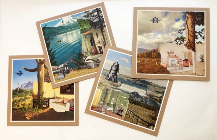
From Colin Herrick:
When Jakob and Dag approached me about releasing this new collaborative album of theirs, I was of course thrilled, being big fans of both of their work already. The title Stadsbilder translates to “cityscapes”, and they had told me originally that the concept was one of man versus nature, the changing of cities over time, and the general ebb and flow of our control over our environments. As a few of the tracks had an almost “industrial” sort of ambiance about them, I decided to go for a futuristic sci-fi look in the designs. The collage featured here was the first one that I made, and I ended up creating a total of 50 uniquely different collages, all of which ended up on the jacket covers of the now sold out, limited Deluxe edition versions. As source material for these analog collages I used garish 1950’s Views of the American Southwest prints, prints from a book of 1930’s interior household design, and even older industrial machine shop engravings, all of which were cut/torn out by hand, and reassembled into fantasy landscapes of a sort. For this cover of the “standard vinyl version”, I decided to scan the collage before adhering the individual pieces, so as to accentuate the roughly torn edges and lend an even greater feeling of dimensionality to it. In mid 2022 I will be bringing out a lovely book of the 50 collages that I made for this release. This will be available at the same time that I release a larger, lavish hardback book on the Time Released Sound label and our first decade of designs and musical packaging. Please stay tuned!
Jim Wallis and Nick Goss ~ Pool (Tip Top Recordings)
Artwork: Nick Goss
This isn’t the only image Nick Goss painted after his residency on a boat in the Adriatic Sea; more are printed within the LP. The image portrays motion and resolve: a sea of calm inside the boat, despite turbulent waters. The full set reflects the relationship between humans and the sea.
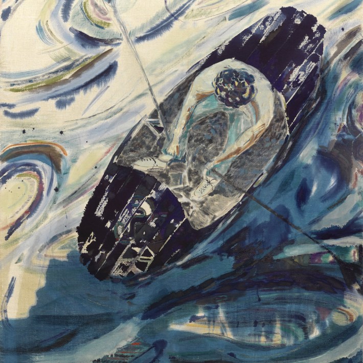
Nick Goss
Boatman is a painting I made in 2018, the materials are distemper and oil on linen. I had been painting a series of works about the floods that occured in Holland (Where my mother’s side of the family come from) in 1953. The series was called De Ramp, which means “the disaster“ in Dutch and depicted an imagined deluge of water washing through the streets of London where I live. A major influence was J.G Ballard’s Drowned World. In my paintings, the idea of collapsing time is important, combining contemporary images with events that might have happened many years ago.For this particular painting I liked the idea of a solitary boatman steering his way through turbulent waters. The viewer wouldn’t be sure if this was figure was escaping a wreck or flood or if he was simply out for some exercise – you can just make out the number three on his boat. I painted the scene allowing natural indigo and other pigments to stain the linen and move in a fluid uncontrolled manner. The figure is painted with more detail in oils.
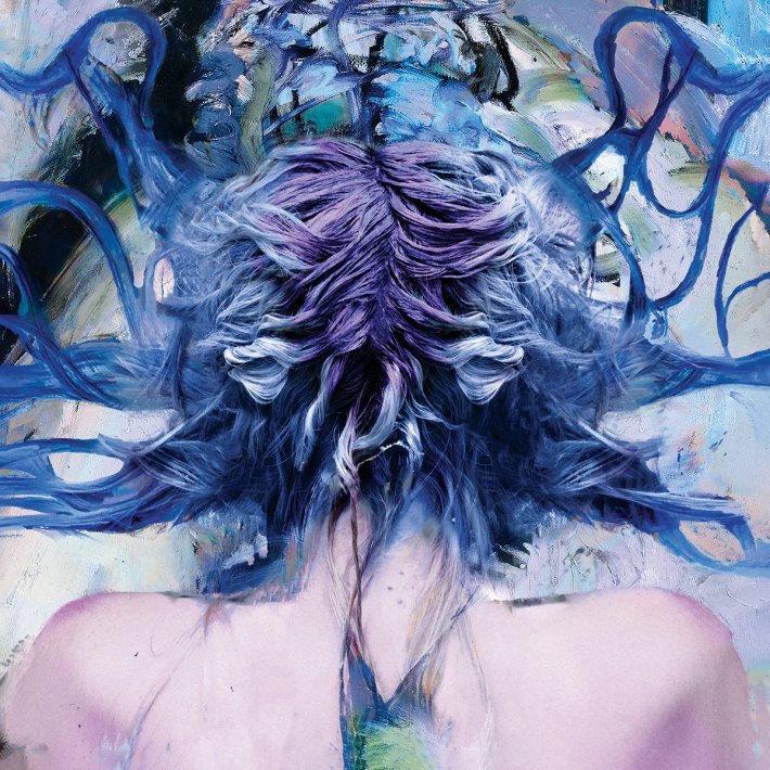
Lyra Pramuk & Various Artists ~ Delta (Bedroom Community)
Images by Nufolklore Studio using Original Photographs and Paintings by Donna Huanca
Retouch and Image Composition by Sayuri Chetti
Graphic Design by Gergő Kovács at Nufolklore Studio in Budapest
If any image this year has the chance to become iconic, it’s this one. Lyra Pramuk is a boundary-crossing artist, and the bold nature of her music is highlighted by this incredible visual mystery. Is it photography? Is it paint? Like the artist herself, the image resists any attempt at definition.
Simon Leoza ~ Albatross (Rosemarie Records)
Artist: Christy Lee Rogers, “Our Hopes and Expectations”
Did anyone else not notice at first that there are people in this photograph? That’s why we’ve blown it up, and why we insist that LPs are visually superior to CDs. Christy Lee Rogers is known for her unique take on underwater photography and is responsible for Apple’s Water + Light imagery. With this piece, she conveys the fluid, colorful tone of Simon Leoza’s music: a perfect match.
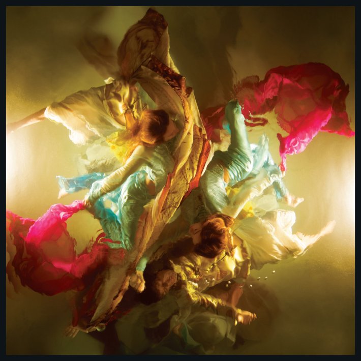
From Christy Lee Rogers:
I’m obsessed with the transformative qualities of water and love to use it as a creative muse. This image “Our Hopes and Expectations” is from my Muses, collection, which celebrates the vulnerabilities and beauty of the human body, mind and spirit in an underwater setting. I photographed it at night in Hawaii using chiaroscuro contrasts of light and darkness. There is always this trapped passion in me that must come out in some way, and a desire to connect with the universe and knowledge of what is beyond our current reality. I immediately fell in love with Simon’s music and felt we understood each other through these different mediums. In many ways we were expressing the same ideas, so it was an honor to collaborate with him on his beautiful album.
From Simon Leoza:
For months I had been looking for an artwork that would reflect the airy yet dramatic evocation that my record had. I remember stumbling on an article about this artist making underwater photos resembling Baroque paintings. And right away I thought “this is it”. The colors, the textures of the clothes and the position of the underwater bodies – it really looked like a handmade painting ! I went through all of Christy’s works and it was really hard to choose. This one was standing out. As much as this was taken underwater, it felt airy for me – like dancers in the sky. And that particular feeling was very much present in the album.
Simon McCorry ~ And Where Are You Really From? (Polar Seas)
Artwork: Louise van den Muyzenberg
At the time of this writing, yet another migrant crisis pits immigrants against those who would keep them out in “protection of national identity.” And yet, humankind stems from the same tree, and we have more in common than we think ~ or fear. The theme of Simon McCorry’s album is beautifully borne by the artwork, a new interpretation of yin and yang.
From Louise on TWINS:
This image came to me in a dream. Apart from the figures, there was an atmosphere of sacredness. I knew they were in a circle. I read about the primordial twins, the warring twins and knew the paradigm shift comes when their togetherness equals their otherness. I wanted to convey the here-and-now ness of an inner state of ‘othering’, as well as in the outside world. Initially they were painted on a previous background, a history of images superimposed. Later i changed the scene to a minimalist place, a borderland., a meeting place. My family comes from many nations. I owe a huge debt of learning and kindness from cultures across the globe. Consciously the painting is a call for respect and seeing. Truly seeing a common humanity.
From Simon:
I had planned this album as a follow on from 2019s Border Land for some time. It made sense to make overt the ideas I had always floating around. Because of the pandemic the music took on an inward course. It’s not a ‘pandemic’ album though. I thought a lot about my own mixed ethnicity and how that’s defined me in ways that are not always clear to me. The feeling of not being one thing or the other. How different people react to me and place me in different ways, which has had a destabilising effect on my own sense of identity and worth. I thought how this is reflected in subtle ways in the way I create music, it’s surface and the structures that lie underneath. I like putting contrasting ideas together to create ambiguity and see what new meanings suggest themselves. Though made independently as work in its own right Louise’s ‘Twins’ just worked in so many beautiful ways with the title of the album, the individual track titles and the music. Two figures looking out of the canvas almost defiantly, like a challenge ‘and so what?’ It can go off in so many different directions. The subject of identity and belonging is a complex one that serves not answers but more and more questions and self reflections and less certainty. As certainty kills everything.
trajedesaliva ~ Ultratumba (áMarxe, Ferror Records and GH Records)
Artist: Emilie Lagarde
The macabre artwork of Emilie Lagarde is the foretaste of a dense emotional album, haunted by the ghosts of dysfunctional families, tinged with a filament of light so subtle it may be overlooked. The album sounds like the cover; listeners be warned!
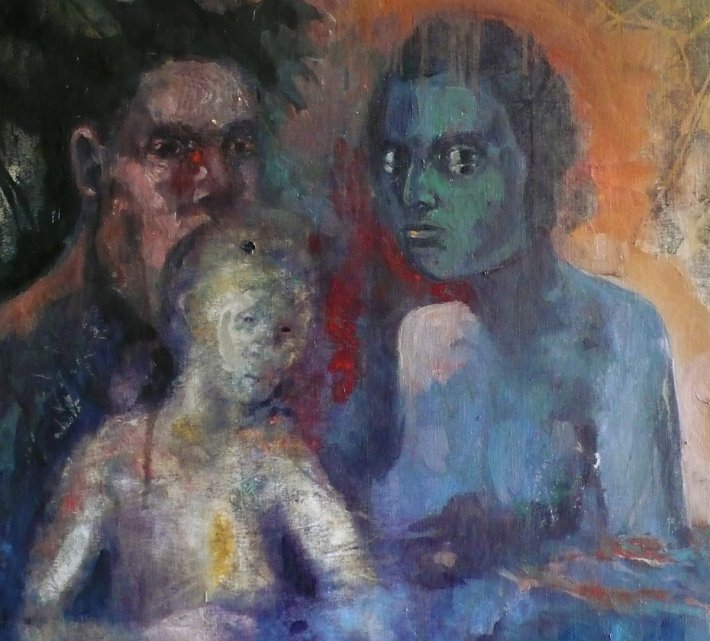
From unavena (trajedesaliva):
I came across Emilie’s art by chance as we were about to finish up the recording of Ultratumba and was immediately drawn to the dreamlike quality of her work, and, very especially, to the painting that we later decided had to be the cover of the album. This particular image just felt as if Emilie had, somehow, painted a portrait of our family. She couldn’t have though, because she didn’t know of our existence at the time. It’s us! — Mon said when I showed it to him. Such is the resemblance that family portrait bears to ourselves.
It also matches the concept of the album rally well, because Ultratumba basically speaks of that which hovers between presence and absence, life and death, ghosts of previous generations haunting subsequent generations, the familiar becoming otherworldly.
Also, the connection between our music and her palette, motives and painting style (I can sense how she gives herself space to be spontaneous and how she’s also open to happy accidents, just like we are with our sounds) is so deep and natural…, we’re just like a twinflower in a dark forest.
From Emilie Lagarde:
The paintings in Ultratumba speak about the impact of those in our family who lived before us. Awaken, we walk in the dreams of our ancestors’ ghosts.
In a way, the path of anyone’s life is already drawn by ancient lives. There is something brutal in this thought that you can find in my paintings but it’s also a hopeful one: it can be experienced as a prison cell, or a structure from which to build one’s life. It depends on how you take the essence of what was before.
For the oil painting on the cover, I worked the canvas back and front. The fabric is lightly primed, and, so, when I apply the colour, it transfers to the reverse as well. So I kept switching sides during the process, eventually concentrating on just one.
Yuting Wu ~ Mindtrick (First Light)
Artwork: Max Mudie
What is that thing? Turns out it’s a macroscopic image of the slime mold Comatricha. Max Mudie’s website is called allthingfungi, and there’s loads more where this came from, enough to fill a book. The power of this image is that it leads directly to Yuting Wu’s similarly futuristic music.
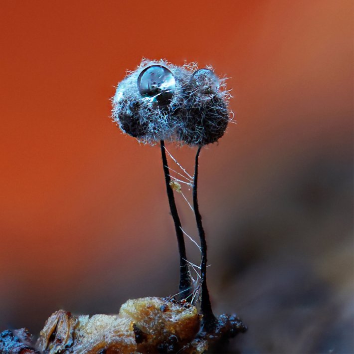
From Liam Killean, founder and creator of First Light:
We were keen to find an image of something that looked alien but organic so fungi made sense. We had been following Max’s photography for a while so when we came across the image that we selected it felt like a no brainer. Yuting is more of a tech-focussed artist than conceptual so we had complete creative control on this one!
Richard Allen
