
 Album art can draw listeners to music, or push them away. The best album art enhances the overall presentation, while the worst detracts from it. In some cases, we’ve reviewed albums because of the art, while in others we’ve declined. In this feature, we’ll take a closer look at some of the year’s best artwork and share words from the designers, labels and musicians involved.
A huge thank you to Nayt Keane, the curator of this feature for the last three years. Nayt is a new father again (congratulations!) and this year has contributed the awesome cover collage. He’s set a template for years to come, and this article is indebted to him. I’ve filled in as guest curator this year and hope to honor his example. This year’s selections are presented in alphabetical order; we hope that you’ll enjoy what you read and see!
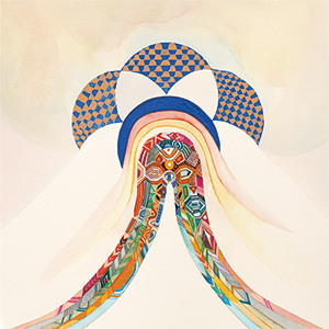
 Anna Caragnano & Donato Dozzy ~ Sintetizzatrice
(Editions Mego)
Front cover painting by Angela Scaramuzzi Cover Design by Koto Hirai Words below by Koto
Theme
This album uses only Anna’s voice for all the tracks. The title of the album, Sintetizzatrice, is a coined word by Donato. It puts the two Italian words together, sintetizzatore (synthesiser) + trice (the end of a word which shows human).
After the music and title, the image of the album was really clear from the beginning. It was a combination of an image of Anna’s mouth and an expression of the energy and warmth of her voice.
Then an idea of putting Anna and an olive tree together quickly entered our minds. Anna was born and raised in the beautiful countryside of Puglia State in southwest Italy. The place has huge olive fields everywhere. The trees are strong and energetic and have an expanse of the branches like her voice and also like herself.
Donato’s parents are from Puglia too. So I can say this is a very personal design.
Process
First I asked Anna to take a picture of olive trees around her hometown. Then I made a composite photograph with two pictures, Anna and the olive tree, likening the tree to her voice. It was already beautiful but still missing warmth. It still needed a human touch.
One of Donato’s sisters, Angela Scaramuzzi, loves to do oil paintings. We asked her to paint the montage in oils. She matched it precisely with the montage I made and added the perfect warmth of human touch we wanted. I took the picture of the oils with my camera for the cover and decided to use the reverse side of the canvas for the back cover design as like the sleeves are canvas itself. This is the artwork by all four of us in collaboration.
 Crypto Tropic ~ S/T (Le Cabanon)
Photography : Pierre Torrell
Words by La Cabanon Records and Crypto Tropic
Crypto Tropic’s vinyl edition is linked with an insert, which is not really an insert. It’s a treasure map – with coordinates and crypted clues – which offers a contemporary quest to seek three artefacts hidden in different natural places. It resonates with Crypto Tropic’s name and with their creating process, thus they continue to crypt in the public space.
Mystery, underground, crypt, secret, game… key words which follow the album composition until its release.

 DJ D003Y ~ Cryptogram (Illuminated Paths)
Design: Jeff Johnson AKA D003Y
For my past releases, when possible, I have engaged visually inclined friends to help me, to my general satisfaction. I rarely had much interest or appreciation of my artistic skills, thinking of myself primary as a musician.
However, for Cryptogram, which means a coded or hidden message- certain images swirled around in my gray matter, and I felt confident and inspired to do it myself.
I drew some inspiration from the work of Arthur Conan Doyle and his Sherlock Holmes adventures, especially the story “The Dancing Men”, in which a cryptogram is deciphered.
I am also a huge fan of 1950s and 60s Jazz albums, especially from the Blue Note records, which have a distinct flavor: typically 2 or 3 complementary colors, simple shapes, and little text.
In addition, being a student of Anthropology, I have always been fascinated by the huge earth glyphs called the Nazca Lines in South America, which depict animals and an anthrpomorphic figure called “the Astronaut”. These lines can only be seen from far above, indeed even from space. Their origin is up for debate: some think they are alien or have some mystical provenance. To me, these are the real cryptograms.
So I took these ideas, put them in the epic blender of Photoshop CC, and went to work. I chose that color red because it is bold and embodies strength; also because the label Illuminated Paths promised me a matching red cassette, to my delight.
I hope the artwork inspires you to consume the music and decipher the messages inside.
 Georges Forget ~ Le dernier présent (empreintes DIGITALes)
Design: Georges Forget
Topic
The illustration on the cover of the disc is based on the multiple meanings of the French title “The last present.” Understood as “the last now” and “the latest offering,” the pose of an individual subject with cords coming to life on a twilight background was a way to illustrate the end of a period in my life as a composer. Including quite dark and nostalgic rooms, the picture is clear to me.
Process
I discussed this with the way I approach in my compositions sound materials; I basically worked by gluing in Photoshop. Not being a professional graphic designer, the attached image shows an example of composition of my visual work. I printed the silhouette I had done by computer, then I glued on a cardboard plate to come add real cables. The photograph was then cable mounted on the original figure and finally processed digitally.
 Hidden Persuaders ~ Elegies and Curses (A Giant Fern)
Design: Paw Grabowski/øjeRum
If there ever were moments in the course of the label where the music and artwork matched perfectly, this is undoubtedly one of those cases. The gloom and solemnness of Elegies and Curses can be immediately apprehended at the first glimpse of its cover, vividly giving away the kind of ride you’re about to embark in. Even more so when the scrutiny of its puzzle-like arrangements focus our attention on the individual details, the image as a whole starts to appear oddly constructed, revealing dark unsettling corners behind its imposing structures, driving our curiosity far further into the uncertain horizons where the divergent perspective lines imaginatively meet. And this is exactly how I could attempt to describe the atmosphere that emanates from Elegies and Curses.
Although initially the collage was not intended to illustrate the album’s content, the cross points between the two actively reinforce one another, now making this image an integral part of the experience promoted by the music. The work of øjeRum is not only strikingly beautiful but has also the ability of inducing powerful interpretations and absorbing our imagination into his compelling world.” – Carlos Costa (A Giant Fern)
“I’ve contributed several collages for A Giant Fern, most notably the twelve collages for last years September batch. Among them was another Hidden Persuaders tape. Back then I told Andreas Brandal that I’d be willing to contribute cover art for more of his releases as the imagery seemed such a great fit for his music. So when I was asked if they could use my collage ‘Late October’ for Elegies and Curses I didn’t hesitate to comply.
The collage is actually named after a track from The Pearl by Harold Budd and Brian Eno. This must be my all time favorite album and definitely the album I’ve listened to the most. I just never get tired of it. I’ve named collages after nearly all the tracks, since this album so breathtakingly beautiful expresses emotions similar to the ones I’m trying to convey.” – Paw Grabowski/øjeRum
 Ian William Craig ~ Cradle for the Wanting (Recital)
Design: Ian William Craig
The artwork of Ian William Craig is colorful, sublime, and impressionistic, a visual reflection of his music. To look at the cover (and the matching internal art) is to delve into a world of vibrant nuance. Some of the colors and shapes are obvious, while others sneak up on the viewer; the same is true of Craig’s music, layered and looped, filled with hidden nooks and crannies.
This is the artist’s second appearance on our list, following last year’s A Turn of Breath. It’s a sign that Craig is creating a distinctive visual identity.
 Julia Kent ~ Asperities (Leaf)
Design: Anthony Gerace
The cover art for Asperities came out of several attempts to try and understand, from my own perspective, what Julia was going for musically and conceptually in her music and specifically with this LP. Before coming up with the artwork that we ended up settling on, I made several attempts that felt too graphic and academic; it was only when I did something more gestural and intuitive that the work and the music synched up for me. I think Julia’s music is amazingly complex yet totally emotionally satisfying, and I wanted to try and make something that invited listeners in without allowing their gaze to settle. (Anthony Gerace)
Anthony Gerace’s powerful cover art for Asperities perfectly conveys, in a subtle and slightly unexpected way, the sense of tension and of conflict that for me was a main impetus for the music. Balanced as it is between figuration and abstraction, the cover image to me conveys an aura both of universality and of mystery, of unease and of beauty. (Julia Kent)
 Kaitlyn Aurelia Smith ~ Euclid (Western Vinyl)
Design: Salihah Moore Kirby
Theme
Kaitlyn’s music is so visual for me it was fun to play with images as I closed my eyes and took a deep listen to Euclid. The album feels like an adventure so maybe the arch is a doorway into its dreamy and sensuous world, or a beautiful wizard, or…? There was a definite welcoming energy and openness, whereas the back has a more complete and full feeling.
Process
Kaitlyn and I worked together on some ideas and I did a few rough sketches. I love playing with color and not premeditating too much on design, so it can take its natural place in the world. Then I listened to the music on repeat and went for it. Her music really takes me to a visual wonderland. I listen to her music when working on art in general. The back cover was totally intuitive.
 Lastboss ~ Pattern Docile (Illuminated Paths)
Design: Lee Prescott
Theme
I have been working with Tate (Lastboss) for the last two years, exchanging ideas and working on art projects in Ningbo, China. I specialise in collage and geometric illustration and was influenced in my work by the likes of William Basinski, Loscil, Brian Eno and a lot of stuff by Lastboss. The artwork came about from an exhibition we had in China called, ‘Mutations’. I made the artwork and Tate made a piece of music for each collage and illustration. The viewers could then scan a QR code next to the artwork and hear the music made for that piece.
The album cover is a piece called, ‘dexterous planets’ which is my interpretation of a colosall Chinese city. The music that accompanied the piece was on point! It was really interesting to see (or hear) how Tate envisioned each piece of artwork sonically. The album is the music from the exhibition.
I really like the fact that I can give Tate a finished piece of work and he will add music to it. It adds something to the artwork and kind of gives it an identity beyond the 2D/3D image. I know Tate likes to add music to the pieces as it gives him some kind of reference point and something visual to work from. On one occasion we swapped and Tate produced a piece of music and I interpreted it with an illustration. It was a challenge!
Process
Every piece of artwork I do starts with the first mark on the surface. I sometimes have a vague idea of what I want the finished piece to look like, but it seldom works out that way. My work is very organic and takes shape as it’s taking shape.
My time in China heavily influenced my work, whether consciously or subconsciously. I was using a lot of old 70’s and 80’s Chinese science and TV magazines for my collage work and was drawing from my surroundings in my illustration work. The collages became surreal depictions of Chinese formality and scientific endevour coupled with Chinese cultural references and their hunger for rapid growth.
My illustrations became based (loosely) on Chinese cities and the never ending rise of the high rise.
The album cover started off as a small square interloucked with another square. It was originally going to be a pattern but the more I worked into it the more i realised it was becoming something else. By the time i had almost finished I found myself looking at this mass of rectangular shapes. It reminded me of what it might look like to look down on a city like Shanghai from a helicopter. But this city had gone out of control and was being built on top of already existing buildings. I placed an image of a shirt in the top left hand corner as a representation of a human presence within this metropolis.
 Lost Trail ~ One Day We’ll All Walk Outside And Stare Up At The Blameless Sky And Wait For Something To Happen (Soft Recordings)
Design: David Teboul
The majority of my sleeve creations start with a photo and it is very often the Slovakian photographer Peter Nejedly who is its author. I love the texture of his pictures, their light, and their very strong style. His pictures always speak, and our collaborations are always creative.
The choice of this picture was clear to me because it represents well the duality of the music of Lost Trail: modern and arty but also dark, vintage and dirty .
The picture was taken at the old abbandoned building near the town where Peter lives. The location is called ‘Kurinec’. Peter’s mum used to work there at the greenhouse many many years ago. Actually it’s part of a ceiling/wall.
For this cover, I wanted something very graphic and very modern. It is also why I have not made the choice to work from a photo of Zachary Corsa as I imagined at the start. I decided to create a new logo for Lost Trail, very round, to settle with the rather straight and square lines of the rest of the design. The biggest challenge for this project has been to wedge the album title that I wished to see appear in full on the cover. It took me a test score to find the right compromise to wedge graph it all. As the title of the album was unusually long and strong I loved the idea of putting up this text in the middle of the artwork as an advertising statement.
 Lullatone ~ The Sounds of Spring (Self-Released)
Design: Pui Lee
Words by Shawn (of Lullatone) and Pui
For this album we got to work with an illustrator we really love named Pui Lee. With each album in our seasonal EP series we hired a different female illustrator from other countries and we were holding up to ask Pui for spring the whole time. We knew she could pull it off amazingly!
Her drawings always make us think about sunny days and wearing shot sleeves for the first time in a while.
Here’s what she had to say about the project:
Theme
I was approached by Lullatone to help illustrate their Sounds of Spring EP, and was very excited, as I had been a huge fan of their work for quite some time. Shawn was working on the tunes still, and had sent me some rough drafts of the tunes for me to listen to, to get a feel for what it would sound like. I listened to the tunes whilst illustrating the cover, it inspired me to think outdoors and cheery happy spring themes. Some of the titles of the songs also triggered of ideas of what to illustrate too.
Process
After being briefed by Shawn of what he was thinking of and listening to the draft of the tunes. I made a start on illustrating the cover. I developed initially a few options based on the same theme but different styles. Shawn and Yoshimi gave me feedback and I developed it a bit more. I work on the mac usually to illustrate. Shawn approved the final design and I prepared the final artwork. We also decided that it would be nice to create a short run of the EP cover as a printed artwork too. So I prepped the artwork and had the artwork printed up as an actual art print, as a risograph. Giving the opportunity for people to purchase the cover artwork with the music CD.
I’m based in London and Shawn and Yoshimi are based in Japan. However we managed to work on this artwork together. The artwork was completed in a very short space of time and very smoothly too. One of my favourite projects to work on this year definitely.
Extras
Once the final design was approved, Shawn suggested adding a bit of texture to the overall illustration. So we looked at adding textured paper in the background to soften the look. I think this worked out great.
 Moon Ate the Dark ~ Moon Ate the Dark II (Sonic Pieces)
Design: Frederic Gmeiner & Torsten Posselt
Painting: Kassandra Jensen
Words by Frederic, Kassandra, and Monique Recknagel (Sonic Pieces)
A Sonic Pieces cover in general is first of all a design object which has to work within our release series. The label’s artwork is based on a minimal typography with few design elements. Therefore we are very happy about our long-term collaboration with FELD – studio for digital crafts – from Berlin, who are very much responsible for our recognizable line. While the layouts for all the other releases were created by Torsten Posselt, the Moon Ate the Dark covers are adorned with the handwriting of his partner Frederic Gmeiner.
“For Torsten and me it’s always a great pleasure to work together with Monique. Developing the artworks in so close collaboration with the label and the artists is a very satisfying process, especially with regards to being able to work with such a subtle sense for materiality and detail. This is also due to the fact that Monique pays so much attention to the production process: Mixing mass printing techniques with hand made assembly makes every copy to a unique object. A physical object that acknowledges the work of everyone involved in a beautiful and extraordinary way.” (Frederic Gmeiner / FELD)
 The design process typically starts with choosing a color for the book cover cloth together with the artists and also think about color combinations for the layout. For the Moon Ate the Dark debut album we combined a red fabric with a dark blue embossing on it. And since I also wanted to do a double album version of the debut and their new album, I suggested to invert the colors to match the two releases. Once this is decided a sample of the book cover cloth goes to FELD together with the information that needs to be on the cover and they send us their drafts for approval.
In November 2014 Moon Ate the Dark had played a show with A Winged Victory For The Sullen at UT Connewitz in Leipzig, Germany. Artist and painter Kassandra Jensen, a good friend of the band, had joined their show and was introduced to Anna from Moon Ate the Dark who loved her work and suggested to include Kassandra’s paintings in the booklet for the release. I knew Kassandra’s amazing work for a while already and was instantly excited about the idea, so we just needed to decide on two of her great selection of paintings. To make everything fit together, we agreed to focus on mainly blue and red shades.
 “After meeting at the Leipzig concert, I ran into Anna and Chris the next day on the train back to Berlin. Anna mentioned being interested in using my work, and sent me the album so I could get a feel of the music. It was really important to me to understand the movement and colors of it before I could select what pieces would fit. Since the colors for the layout were already picked, one painting dear to me immediately came to mind. It was very graphic, layered piece, mainly with strong reds and creams, and blue accents. Finding a companion for it was a little more challenging. At first, I was drawn to the other selection just for the fact it fit into the color pattern we had, but I wasn’t sure if the pantings complemented one another strongly enough. Yet, for whatever reason, side by side and accompanied by these two amazing albums from Moon Ate the Dark, it came to life. The paintings became cohesive, and still held a strong enough contrast to reflect the spaces between the different albums. I always paint with music in mind, and am really happy with the shapes and movement created with the music and how the art work can reflect that. I have always admired the care and process Monique puts into all her releases, so to be apart of this and have my paintings translated into her vision was a pleasure!” (Kassandra Jensen)
“Chris and I met Kassandra at a show in Leipzig, at the time we were looking for some artwork for the new release. I had been aware of Kassandra’s beautiful paintings for some time, but it was only when we met at the show that it clicked with Chris and I that her work was exactly what we had been looking for. Looking through her work after the show, it became clear that it would also be a perfect companion with Monique’s unique design aesthetic… We really felt that, with Monique and Kassandra’s help, we would be able to find the two paintings that had that perfect fit with the music and the colour scheme. We couldn’t have been happier that they were both as enthusiastic about the collaboration as we were, and about the result!” (Anna Carter / Moon Ate the Dark)
 Music Komite ~ Congo Square (Discontinuerecords)
Design: Raul Gomez
Theme
I´d been working for 10 years ago on all Music Komite designs (covers, posters, merchandising, etc…). It´s been really great because Calde and the rest of the people give me total freedom for the design. We always look for a similar style for each album, but with its own personality. In Congo Square we looked for the right balance between electronic music and the folk and analogic roots of the project. We wanted to show a positive sensation, kind and beautiful, far away from the darkness. In this design we play with many layers in the same way as the music … a lot of different sound layers. Also we mixed different objects in a cut and paste style, similar to their music, which mixes many instruments, acoustic and electronic.
Process
The Creation process is digital, but based on handmade textures, which are scanned and then vectorized. The elements are drawn with a vector illustration software, but I also mix in some details drawn with ink. We use a reduced chromatic range of colors that multiply and superimpose simulating silk screen printing techniques reminiscent of the DIY style. The work was great fun but also crazy because we inserted too many textures and the computer looked ready to explode!!!!
 Phil Tomsett ~ Broken Memory Machine (Fluid Audio)
Design: Dan Crossley
Photography: Colette Saint Yves
Phil was great in giving lots of background information about the music and the underlying theme that influenced the musical process. The original idea being a road trip album, the narrative about a brother and a sister who lose their parents and family home and find themselves in a broken British landscape, having to journey across the country to find some kind of sanctuary/resolution.
We was instantly drawn to the theme and knew we could come up with something that reflected Phil’s vision. The first thing was to think about how the package would come together as a whole (CD cover design, prints, maps, etc). It’s easy putting together a physical package, but not always so easy to pull it off and reflect the artist’s inspirations behind the music. We quite often like to use the half human/half animal drawings for our covers and felt this would work perfectly for the album… The wilderness aspect combining with the travel theme, the use of backpacks helping to bring it all together. We feel very happy with the result.
The next thing was to think about imagery for the double sided prints… This was a no brainer the more we started reflecting on the music and Phil’s vision. We had worked with Collete in the past through the Fluid Radio web site and knew her work would be perfect for this album. In the end we went with 18 images on 9 x double sided prints using edits our end for the faded circles that are placed on different parts of the prints reflecting subliminal messages. It deliberately has an eerie feel to it, again something we feel reflected the music/track-listing perfectly.
This was all complimented with vintage 1940s-60s maps and local area information from the South West of England, the area used as a backdrop for the theme/story.
Rone ~ Creatures (InFiné)
Designer: Lili Wood
With cats swimming in spaghetti-like strands of hair, the cover and its supporting teaser (seen below) demonstrate a sense of whimsical fun. The album is a perfect reflection of its internal and external art, a match made in musical heaven. See more of Lili Wood’s fantastical art here.
 She Spread Sorrow ~ Rumspringa (Cold Spring)
Design: Abby Hellasdottir
Photography: Stefano Majno
Words by Alice Kundalini
The idea of the artwork for Rumspringa‘s cover was born from the concept of the album and the sounds. The aesthetic of the work is very important to me and I believe that Rumspringa would not be a complete work without that kind of image and aesthetics. All this was born from the personal and artistic meeting with the photographer Stefano Majno. I knew his work and when I told him about my project and what I had in mind, everything developed very naturally. What I was looking for was an idea of purity, chastity, weakness, pain, suffering, but also desire, sensuality, repression. I did not want to fall in the classical aesthetic stylistic elements of the genre and I would have loved to use my own image, because the work is so much personal and intimate. With these ingredients Stefano managed to pull out the essence of Rumspringa from the aesthetic point of view, beyond the sound. And so we managed a photo set: I really loved the idea of a set in the wood and when we were there he took a lot of photos of me and the place. It was not difficult at all, indeed working with him was really spontaneous and somehow liberating, even as reconciliation with my image and my body. The last, but not less important, part of the work was by Abby Helasdottir who create the cover and the artwork with the Majno’s photos. She choose the photo of the cover, the color white and a very simple and modern graphic. They did a great work, perfect for the kind of aesthetic I had in my mind. And I could hardly imagine a better cover for Rumspringa.
 Silk Saw ~ Imaginary Landscapes (Kotä Records)
Design: Grisha
Words: Gleb Glonti
Theme
Grisha (the man behind this artwork) is a Moscow street artist. He usually creates things that don’t live a long and happy life. As many graffiti artists he is an artist first, and then graffiti or whatever. He does drawings on paper and glass, sculptures and more. We have strong relations with some individuals of Moscow’s graffiti scene. And that is how, through them, I know Grisha and his art. So when we started thinking on the art for Silk Saw music, we knew where to find it.
Process
First I thought Grisha might create something, but I never like an idea when art is created as a commission. It’s always a boundary in this case and there are some restrictions due to time and other factors. So we try not to assign artwork as a task. Instead we put it in the natural way for the artists with no restrictions, trying to interest the artist with the theme of the album and the music. This way we hope to get something natural that is born inside and bursts outside. In this case for Silk Saw we didn’t have much time so we decided to choose from what had already been created by Grisha, and we were fortunate enough that he had already done everything that we were needed.
 The rest is just the technical side. We did choose the illustrations. Marc and Gabriel (Silk Saw) agreed on that right away. They were just: “Allright, this is what we need”. Then our designer did very laborious work to put the hand drawings into what we could use as an album cover. We needed to clear everything that could look like “dirt” or something that looked “inappropriate” on print and at the same time we’d wanted to keep the analog feeling of the image. Since it was created by hand, we felt obliged to keep it.
As a result we have 3 pictures just right for the 3 titles (a title for each carrier and a common sub-title). First for the Imaginary Landscapes download and CD we used the dreaming girl, who is actually dreaming and crying. Then “Birds” for Parallel Landscapes and the butterfly for the subtitle (Imaginary Pains).
There are lots of metaphors inside, and our choices just add some more metaphors, so I leave it to the observer to glean the meaning. What I know for sure is that this pictures might look great on the wall!
 Various Artists ~ You Are Welcome Here (Fabrica)
Design: Joao M. Da Silva
Photography
The tile pattern in the background is from an archival image of Mamluk tiles from Damascus, Syria that dates from 1420-1450. The black and white image was sourced from a recent full-color photograph of refugee children in a refuge camp in Jordan.
Theme
I’m an admirer of Islamic art in general, but especially tile and mosaic designs, and I wanted to incorporate that to make a positive connection to places like Syria which most of us in the West now know only as a place where there is a terrible civil war and in which the Islamic State (aka ISIS/ISIL) has taken hold of various cities. I think it’s really important to continue to highlight all the amazing contributions that the Arab world and Islamic culture have given and continue to give us, especially in the midst of so much the prejudice and ignorance that some of us in the West have shown towards that part of the world. But I also really wanted to add a human face to the art so I looked for an image that included people and could convey this idea of migration, pilgrimage and seeking out a better life. Something that some of us experienced firsthand and that most of our ancestors knew all about. I found an image of people, mostly women and children, walking down a road in the Jordanian desert and it also happened to remind me of some of the iconic images of the U.S. civil rights marches that took place in the American South. Once I found the right image, I decided to put them together.
I do some of the graphic design and layout for a lot of Fabrica Records releases and tend to favor very minimal cover art. I knew that a lot of the music that people volunteered to donate to this compilation would tend towards the dark, mournful and in many cases very abstract. So, this time I wanted to make something that made me feel hopeful; I wanted it to be uplifting and colorful. I was inspired by some of my favorite album cover art done by the Mississippi records label, for example the Lipa Kodi Ya City Council and I Woke Up One Morning In May compilations. I love the way a lot of Mississippi Records cover art really has a hand-made “folk art” feel to it which is only fitting since most of their releases revolve around obscure American folk music of the past and not-so-recent past. A lot of the music on those compilations was made by some of the most marginalized people in the world, people who really struggled to live day to day, yet their music could be extremely uplifting, humorous and celebratory. I know that most of us, experimental and noise musicians, make what can sometimes be unsettling music but I really think most do so out of a place of love for the world and people around us, not because we are misanthropes (my apologies to the misanthropic hordes). Many of us use music as a form of catharsis.
Process
I used Adobe Photoshop to combine the two original source images. I used a few brightness and contrast filters, played with layers, that’s basically it. This was very much an improvised affair. I flipped the original tile image so that the one tile that had a darker hue could serve as a celestial body on the upper right hand side of the image. I like the idea that people can interpret the image anyway they want: it could be day or night, the people be walking with their backs to the sun, or using the light of the moon or of a star to follow a path. It’s in the eye of the beholder.
 William Ryan Fritch ~ Revisionist (Lost Tribe Sound)
Design: João Ruas
Words: William Ryan Fritch
Process
Not a whole lot is known about João’s process with this piece other than it was created using acrylic paints on wood. When Ryan Keane first introduced me to the Artwork of João Ruas, I was absolutely hell bent on finding a way to work with him on the subscription series we were planning. João’s talent is so immense and the painstaking process of drawing and bringing so much depth and detail to these works entirely by hand is awe inspiring. We were so fortunate that João agreed to work with us for this project, and it is impossible now for me to imagine putting these records out with artwork other than his.
Theme
With Revisionist, the album’s central focus was on our abilities to unnaturally distill, reframe and revise occurrences (either intentionally or otherwise), which were strongly supported and enhanced by João’s depiction of the Greek character Arachne. Arachne was a great weaver that was so overconfident in her abilities that she proposed that she could weave more beautifully than the gods themselves (Athena).
There are two versions of this myth, one in which she challenged Athena to a weaving contest and created a boastful piece speaking of the injustice of the gods that was far more beautiful than Athena’s. In Athena’s rage, she tore Arachne’s work to shreds and transformed her into a spider that she and her descendants would have to weave for all time with their insignificant threads. In the second rendition of this myth, Arachne loses to Athena and her punishment is that she would never be able to touch a loom or needle again. Then out of pity Athena turns her to a spider so that she may be able to weave without loom or needle.
The first rendition of the myth shows a fallible yet vengeful god, human skillfulness and beauty that can exceed the beauty and splendor of nature or gods, and the lowliness of non-human animals all to suggest that it reflected the values of a very humanist culture. The second version of the myth that emerged hundreds of years later depicts an infallible, merciful and omnipotent god, boastful yet inferior human ability, and the splendor of the natural order/animal world: a far more pious and indebted worldview. This highlights how the revising of a myth can says more about the ethos of particular time than the myth itself.
 W00DY ~ RNBW (Self-Released)
Design: Mona Maruyama & W00DY
I worked with Mona Maruyama on the artwork: a very talented visual artist, photographer, graphic designer and musician. I sat down with her as she layered images from old books (one of a ball pit which is noticeable), blind contour self portraits that I drew, an image of myself that she drew, and my handwriting. The cover is designed to describe my music–a colorful and somewhat manic collage of sounds with a very personal touch.
Richard Allen


Pingback: Best Album Covers 2015 on A Closer Listen | She Spread Sorrow
Pingback: øjeRum |
Pingback: New Year’s Revolutions: How to Get Noticed in 2016 | a closer listen