
 These are times of widespread disconnect, and music is one of the most genuine ways for a person all alone to feel understood. We’re seeing DIY backlashes against this loss of connection everywhere (Just look into the boom on homesteading crafts and farmer’s markets). To sell albums the handmade element is becoming almost necessary to get people’s attention. Many of the albums in this feature involve for the purchaser a unique experience. Handmade paper, specialty printing, yarn, boxes, scents, stitching, transparencies, layers layers layers. Some of today’s newer independent labels go for broke on presentation.
And what of digital only releases? The album cover is often all they have, making it even more essential. It isn’t just music. Every one of us is seeking an authentic experience, and a quality piece of cover art and the subsequent design of an album is a beacon for that desire. Every album reviewed on A Closer Listen in 2012 was fair game; here are the top 30 album covers of the year, along with some honorable mentions.
Top Ten
Simple. Bold. Spartan colors or just black and white. Oftentimes less is more. The top ten album covers, as voted by our writing staff, share a power through simplicity. Only two feature the artist name and title, while the others didn’t deem it necessary. The imagery is that effective.

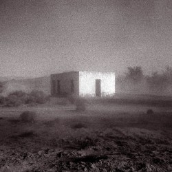
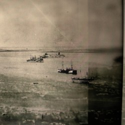
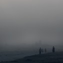
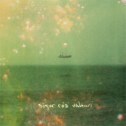
Photography: Eirik Holmøyvik
Design: Michael Waring
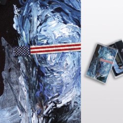
1. Ian Hawgood ~ The Shattered Light
This photograph gives it all in one glance. On first look, the photograph evokes a deep solitude. It took Ian Hawgood four years to write this album, and it’s easy to imagine him alone amongst the fjords of Iceland in that pointed shed, processing the deepest of hurts. The album’s cover was photographed by Norwegian photographer Eirik Holmøyvik while traveling across Iceland. This tiny shack in the winter amongst dynamic geography speaks volumes about people overcoming hardship. ‘If someone can make it in that thing, then my First World problems don’t seem all that smothering.’ Maybe there’s a positive spin to put on things? On his father’s passing Ian wrote for Fluid Radio, “The light of life was shattered, but these shards of memory and eternal being remained, floating like embers: bright, bright embers that could last forever.”
Process
Eirik Holmøyvik, photographer: Unlike some of the other covers I’ve provided, this photograph is a digital capture. It’s a classic black and white landscape from North East Iceland, about 4 hours drive north of Reykjavik. It’s a place of gravel roads and remote farms. I came over this amazing cabin which mirrors the mountains in the background. To make the photograph work, all I needed to do was to isolate the subject in order to enhance the clean and strong shapes of the cabin and the mountains.
Collaboration
EH: I’ve provided cover photographs for several previous Home Normal releases, including Ian’s 2010 release “Slow Films in Low Light”. So I guess he just turned to my portfolio for the latest album as well.

Artwork and typographical design: Dennis Huddleston
2. 36 ~ Lithea
Red, White and Black is my favorite color scheme, and Dennis Huddleston’s cover artwork for his latest 36 album is mighty unforgettable. It’s only smoke, but the symmetrical mirroring creates a sense of awareness. Of life. Smoke by nature is a luscious process to observe, evidence that something has ended, but to think that this boldly colored smoke might be staring back at you…
Theme
Dennis Huddleston of 36: When I designed the artwork for Lithea, I wanted it to reflect the concepts for the album itself; something veiled, organic, minimal, dark but beautiful.
Process
DH: I used images of smoke against black isolated backgrounds, which were collaged together in Photoshop and melded in a near-random way to create an almost Rorschach-style mirrored image. I’m a sucker for the traditional black/white/red colour scheme and after multiple versions were made, I finally settled on the final artwork you see on the front cover. It is suitably ambiguous and I love the fact that people interpret it in different ways; just like the music takes each listener to entirely different places.
Extras
DH: The actual digipaks were hand-made by Tom Leggett at ACDSleeve, printed on 350gsm white card, which was then matte-laminated. The overall finish looked wonderful and Tom should be championed for his hard work.
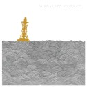
Cover Photo: Paul Randall.
Edits & Design: Harry Towell
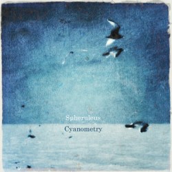
3. Spheruleus ~ Cyanometry
Perhaps we’ve seen images like this before, but this one makes a great album cover. The calm textures appear handmade even before you get ahold of it (and good luck with that, as only 50 of the first run – with this cover image – were made). Simple but rich with mystery, the imagery promises an album of secrets revealed through a natural process, a cover that says “It’s safe here. Rest. Tissue? Tea? ”
Theme
Harry Towell of Spheruleus: The final image reflected the album’s concept of Cyanometry – measuring the blueness of the sky – something I had become fascinated by as I went for a walk to make field recordings and take images for the bonus landscape photography.
Process
HT: The main image was originally taken by Paul Randall who records as Microvolt. He kindly let me use and edit the image. I chose lo-fi textured effects in the editing process to make it look like a painting. The bonus images were also edited using similar lo-fi digital processing methods, which I had discovered using some simple programs. I experimented with the landscape images for a long time, in some cases starting all over again several times. Once these were in place, I then chose Paul’s image as the cover artwork. This didn’t take long to edit, as I had gotten used to the programs I was using and the sorts of techniques I wanted to use.
Collaboration
HT: Whilst Paul supplied the image, it wasn’t actually for this project. He sent me a number of images for an EP he released with my Audio Gourmet netlabel. I edited them all and sent them back to him. He chose one for his project. The one with the birds wasn’t used and I decided to ask if I could use it as the front cover to Cyanometry.
Extras
HT: For the first 20 copies, I hand-stamped a tessellating hexagonal pattern on the front of the card packaging. Then I stamped the album title in the centre. All 50 copies had the hand stamped title. Inside, each copy had both the cover image and also one of the bonus images, a CD of course, and then a hand-written thankyou note to the person that bought it. I had stressed at the time that these were in a limited edition of 50. They sold out in next to no time and I had several emails asking if there were any spare copies left! So I decided on a repress using the money I had made from the first release. For the re-press, I didn’t want to offend those who may have bought on the premise that it was strictly 50 copies, so I did a simple professionally printed card wallet at a cheaper price, so others could get hold of the album. The problem I had with the original image was that as a heavily edited image, it didn’t have a very good resolution for printing to packaging so I had to choose a new front cover.

Photography: Jurgen Heckel
Design & Layout: Daniel Crossley
Booklet words: Vincent Vocoder
Poster/Booklet design: Ian Hazeldine
4. Olan Mill ~ Paths
What looks like devastation to many can be transformed into hope or opportunity through a wise lens. Olan Mill’s gorgeous ambient washes and classical motifs sprang out of Alex Smalley’s history in music therapy for the mentally ill, so he’s had plenty of experience in helping people see things another way. Is this photo a Cormac McCarthy moment, or is it one of the paths from ruin to riches?
Theme
Alex Smalley of Olan Mill: Around the period this record was assembled (late 2010) I was ruminating a great deal on man’s impact on the planet – I was particularly fixated on how we’ve adapted pristine natural environments in order to extract resources for commercial gain. To me this image works as a good visual metaphor for these activities and the potential lifeless path our future promises as a result.
Process
AS: Once I had the Jurgen Heckel images a clear idea formed in my mind for the vinyl design. From years of buying records and studying album artwork I knew I’d have to capitalise on the strength of image over any elaborate design aesthetic. Decisions regarding design were made out of sympathy for the image and the listener’s need for information.
Collaboration
AS: Beyond the vinyl design and book content, I was very happy to let Dan complete the rest of the package with his team. I’d seen his work on previous releases for the label and this was part of the appeal to release Paths on Fac-ture.
Extra
AS: A book titled ‘On Rainbow Corner’ was written specifically for the release and is included with the package. Its conception was the result of the author’s experience with the music, artwork and track names. I thought it was important to have a narrative aspect to the release, a snapshot of someone’s experience of the World and its varying paths. The text acts to blur the borders of mind hygiene. There are strains of autism, personality disorder and psychosis in the piece and all to slightly unsettling effect. Hopefully the music acts as an antidote to any discomfort felt.
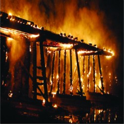
Photo: Unknown
5. Hexakai Dekagon (HXDK) ~ The Letting Go
Total annihilation is a terrible barrage of feelings, but it never looked so good. No one can deny this cover is badass. Most of our staffers included it on their lists. And yet, the image is borrowed from a lost and uncredited source. Some readers are going to have an issue with this fact, but if the message in a bottle has no signature, who else can you save but yourself?
Theme
Nathan of HXDK: I struggled with whether or not to use [the photo], but it seemed to me to be the perfect representation of what I was trying to get across – the burning bridge being a metaphor for destroying close friendships and relationships due to anger and grief (with a liberal dose of self loathing) and also realising that it was necessary to break away from that situation in order to move on or be stuck in that rut to the cost of my sanity and at least salvage some semblance of self and so on and so forth…
Process
Nathan: It’s an image I stole from a Google search as i was looking for a picture of a burning bridge. It would be disingenuous for me to claim any credit for it whatsoever. I’ve tried to find the original source but to no avail. I’d also seen it on a few random blogs and assumed it was just a stock image. I could be wrong, and if someone claims it’s their photo and wants it taken down, then (to overstate the metaphor) i’ll cross that bridge when i come to it. It fits the subject matter of the album perfectly and i didn’t really anticipate it having any impact outside of my small circle of friends. So i just went with it.
Original Painting: Sung-jun Lee
Modified by NRFB
6. No Respect For Beauty ~ Why Perish
Collaboration
June S. Choi of NRFB: The album cover is a work called ‘In Limbo’ by Sung-jun Lee (aka Junebug), a fairly unknown artist working here in Seoul, Korea. As far as we know, this is his only piece of work that was used as a music album cover. After the recording of the album, we and Junebug discussed about the album cover and we actually commissioned him to make an original cover for us.
Theme
June: But during the painting process, we decided to use his past work ‘In Limbo’ for the cover because we thought that it would perfectly suit our album themes such as anxiety, solitude, hope, and beauty. On the cover, only a little modification was made as we removed English lettering, but you can find a printed copy of the original painting inside the album.
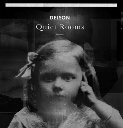
Graphic Design: Bas Mantel
Collaboration
Bas Mantel, designer: Due to the long distance-triangle between Deison (Udine), Mantel (Amsterdam) and Dartley at Aagoo (New Jersey), our collaboration for the sleeve artwork took place through email. To set our minds in the same direction Deison mentioned a few graphic design projects I did, as a visual conduit in style: The lettering on the cover for Colin Stetson’s A New History Warfare Vol. 1 Remix 12 Inch and the inner sleeve design for Philippe Petit & Friends A Scent Of Garmambrosia. Deison liked my use of the black & white xerox copy machine and the cut-and-paste technique to create collages.
Theme
BM: Deison had found a picture in an abandoned basement, a young girl’s portrait which was probably taken in the 1920s. Her intense gaze together with a gentle appearance, alienated in a dimension of an unreal time, not being here or in the present – a ghostly world exists only. This, with her finger pointing to her temple as a reference to a world that you can not see, was for me the perfect cut for the cover. This was the starting point to translate the music into a graphic world of text and image which can be seen in the artwork for the poster.
Portion of Poster using cut and pasted xerox images
Process
BM: After hours of close listening to the music and the discussions I had with Deison about the exploration of the sounds and the cover image, a next phase arose: the research of the pictures’ empty spaces. I called them ‘Voids Of Nothingness’. I zoomed deeper into the picture of the girl to reveal this sense of nothingness. The first result of this designing process was a visual sequence of images of nothingness, a cut-and-pasted graphic landscape in black & white. The graphic length was related to the musical tempo in which the compositions reveal themselves and the search to the point where these visual voids of nothingness would end or start. I envisioned the graphic image to be printed as a double sided ‘Leporello’; a long -60cm/12cm- fold out booklet-poster. This with a cardboard sleeve around to hold the cd and poster together.
lllustration: Yoko Shinto
Art Direction & Design: Takahiro Kido
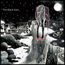
8. Anoice ~ The Black Rain
Theme
Takahiro Kido of Anoice: We wanted to represent “The Black Rain” which is the title of the album and the contents of it, on its cover. You can find the girl sobbing under the black rain on the art work of the cover, because we implicated The Black Rain as not only the rain rendered unwholesome by radioactive contamination but also the tears of people.
Process
TK: The idea of the art works of the album has already been in my head when the earthquake disaster damaged Japan last year. So, it was easy for Yoko Shinto, the illustrator who took charge of the art work, to paint what we wanted to, I think. However, it isn’t possible to deny that some parts of this album were written in the wake of the catastrophic earthquake, tsunami, and nuclear accident that devastated parts of coastal Japan.
Collaboration
TK: At the setout, I drew some rough illustrations which point to place of some objects such as the girl, the moon and buildings, for the art works of the album, and showed them to Yoko. Then she painted wonderful illustrations while referring to my poor rough copies. We really like her art works of the album!!
9. Godspeed You! Black Emperor ~ Allelujah! Don’t Bend! Ascend!
Cover photograph: Charles-André Coderre
Burnt 16mm frames: Karl Lemieux (re-photographed by Yannick Grandmont)
“Atonal Canada” photo: Timothy Herzog.
Others images by Bryant/Menuck/Lemieux.
10. Nite Lite ~ Megrez
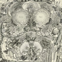
Paper Collage: Myste French
Design: Chris Koelle
Theme
Myste French of Nite Lite: The imagery set aside for the cover collage included all sorts of organic forms and textures. Each of the four elements is featured, with heavy representation of Earth and Water. I was especially drawn to shapes revealing natural mathematics and sacred geometry. The concept behind the piece, and behind Nite Lite, is to capture the microcosm and macrocosm within one cohesive whole.
Process
MF: Following a profound visionary experience, Phil and Myste devoted the entirety of March 2012 to art creation. Together we deconstructed dozens of vintage books, sourcing a massive pool of imagery. We sorted the images by color and theme, and divided them between us. We spent weeks working to externalize the inner teachings we were experiencing. Signs and synchronicities abounded throughout the journey and indicated that we were on the right path. The results were 12 hand-cut and assembled paper collages: 4 monochrome pieces by Myste and 8 color pieces by Phil.
Although we were the vehicles through which these pieces entered the world, we feel that the collages assembled themselves in a way. We simply listened to each component part in order to determine where it wished to be placed. The piece that became the cover of Megrez was Myste’s first completed piece in this series. Though we did not start this project with any destinations for the pieces in mind, once we saw the finished piece we immediately knew it was meant to be the cover. The back cover, completed shortly thereafter, features monochrome circle motifs and symbols of eternity, infinity, alchemy, and rebirth. The pairing of the two pieces seemed natural.
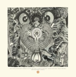
Back Cover Collage: Myste French
Collaboration
MF: The entire process of creating our album, the series of collages, and the concurrent annotated bibliography was a collaborative effort between partners Philip and Myste French. Additionally, Michael Vitrano at Desire Path was wonderfully supportive and enthusiastic about pairing the art and sounds together. We were also stoked to collaborate with Chris Koelle, DP’s art director. He found a beautiful way of designing the layout, text, and vinyl labels while maintaining the overall aesthetic of the pieces.
Extra
Each of the track titles on Megrez was inspired by a different selection of literature, studied by Myste and Phil during 2012. Our transcriptions of the readings are featured in an annotated bibliography and paired with Myste’s photographs of life on Mt. Tabor. The bibliography will be available as an additional publication following the release of Megrez and can also be found here.
11. Michael Price ~ A Stillness
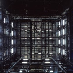
Photography: Klaus Frahm
Layout: FELD Studios Berlin
Process
Robert Raths, founder of Erased Tapes: I actually first thought a graphic approach would be best for Michael’s EP cover. But the sober nature of a graphic just didn’t seem to click with the atmosphere of the music. I began to think that maybe I ruled out photography for the wrong reasons. I remembered Klaus Frahm’s (father of Nils Frahm) theatre photo series and asked him to send me digital copies to look at.
The images I found most interesting were the ones he took of the so-called stage tower – the space located right above the stage, usually filled with lots of rigging and lighting. The way the pictures were taken standing right in the middle of the stage, looking straight up, they become really abstract as you lose the feeling of space – which side is up and which side is down. Taken out of context these images create a completely new space for the viewer. A space that feels otherworldly and yet is so close to both the artist and the audience.
I was amazed how well these images complemented the acoustic space of the four string quartet recordings. In fact, each element seems to amplify the other when you put them next to each other. More than excited about this discovery, I picked up the phone to Klaus. I sent him the music and images in question. He said it was funny as he also thought some of them would make a nice record cover. Luckily Michael felt the same way and we went through all the images and chose the final photograph that worked best for all of us.
Extra
Inspired by the final cover image, FELD Studios Berlin, who we collaborate with a lot these days, created the perfect layout for the packaging. We decided to go for 10″ instead of 7″ to give the music more space for the vinyl cut at D&M, but also the photograph more space for all the detail. After a few phone conversations with Michael we agreed how nice it would be to add printed sheet music of the four compositions in form of a little book, also designed by FELD. Everyone involved couldn’t be happier with the result.

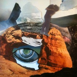
Photography: Will Long
Layout, Design: Rutger Zuydervelt
12. Celer ~ Lightness & Irresponsibility
Collaboration
Will Long of Celer: The cover photo is by me, of a park near where I used to live, in Tokyo during the cherry blossom season. The layout and design is by Rutger Zuydervelt (Machinefabriek). Every album or piece of music for me is tied to an image or group of images, so it’s usually just a process of trying to work with great designers who can match it with the release format. I usually work with the same group of designers for the most part, so it’s easy for us all to know what direction to take. It’s really instantaneous though. A clear idea of the artwork is present almost immediately each time. Rarely does it take a long time to develop, and when it does, those are usually the most frustrating experiences.
Process
WL: The options for the artwork were from a range of similar photos from the same roll of film, though some were different subject matter. At the time I was also collecting a lot of cassettes from thrift stores for their design, and to recycle the tapes for creating my own music. Most of them were 1980’s and 1990’s blank cassettes, but they had special, unique designs. When this project came up, I thought it would be nice to incorporate that vintage look into the cassette design.
Photography: Goran Popović – Coga
Design: Damir Rijovich Originalov
13. Ana Never ~ Small Years
Collaboration and Dedication
Goran Grubisic of Ana Never: There are three photos of our latest release. All the photographs on the cover is by Goran Popović – Coga, our dear friend from our hometown Subotica (Serbia). His work you can find here. The final design is by our also dear friend Damir Lucic, known as Damir Rijovich Originalov.
I do not know what else to mention; it’s hard for me to talk about this, because our photographer unfortunately died of heart attack ten days before date of releasing of our record.
So we dedicated this record to him.

Artwork: Chris Koelle
14. Charlemagne Palestine & Janek Schaefer ~ Day of the Demons
Theme
Chris Koelle: Demons, fire, horrorscape, swirling ambiguous mess, faces, nightmares, hot lava, smoke, fire, and demons.
Process
Chris Koelle: At the very beginning of discussions about the art, we had toyed with the idea of using some photographs Janek had of talismans, skeleton dolls, a person sleeping under a tree, piles of Charlemagne’s stuffed animals, etc. Through more discussion between myself, Michael Vitrano (label boss) and the musicians, we all eventually decided on the more ghoulish, nightmarish, swirling, scary landscape idea, because, well, why not?
Early on, there were some somewhat vague mentions of an Indonesian holiday “where people stay indoors all day and let the demons have fun outside as playtime,” according to Janek. For a while I was confused about the whole cultural specificity of this so-called Day of the Demons; no research turned up anything concrete. Finally Janek reassured me that we shouldn’t worry about it being literal and just have fun with it, make it our own thing.
After lots of discussion, Michael and I agreed the cover should primarily be a large demonic face, ethereal and elusive, but definitely freaky, and somehow echoing the demon face mask included. Ultimately, myself, Janek, Charlemagne, and Michael all agreed on the idea of a more-or-less creepy yet ambiguous swirling mess of demons and other ghostly apparitions, bubbling fiery lava, smokey, liquid, and unsettling. At one point Janek mentioned the hellish horrorscapes of the Chapman brothers as a reference, but “not copying their gore,” he said. I was unfamiliar with their work and had to look them up, and was verily disgusted.
I got the demon-face-collage-thing to where I liked it, then printed it out in a few sheets to use as a guide to draw over on a new sheet. The final piece was drawn entirely in charcoal, scanned, and inverted and further manipulated in Photoshop. At first the monochrome lover in me got me wanting to do a more muted, smokey color scheme. But Michael and I thought we should really go with the hotter colors coming from the black abyss. The back cover design is basically the way the original drawing looks, but colorized of course.
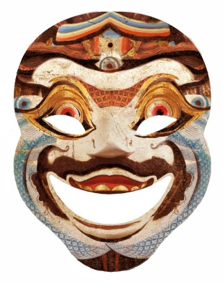
Mask included with vinyl
Extra
CK: I started researching images of pagan masks and demons from various cultures and religions, downloaded a bunch of photos of amazing hand-carved and painted Indonesian masks and other really old pieces of Asian and Indonesian art featuring demons of all kinds, and then I spent a while compositing a collage of all these elements together, which provided the guide to create the ethereal, writhing drawing for the cover. Along the way through these discussions with MV, I half-joked on the phone that we should actually include a demon mask in the package to connect the listener to the experience of hearing the sounds. Michael totally loved the idea of warding off hostile demons by pretending to be one. The idea was crazy and fun enough for everyone so we went ahead with it and I made another collage for the mask design. I should mention that pretty early on MV and I decided we should definitely go with a bright red vinyl color to carry through the fiery vibe.
Photos & design: Sally Ann McIntyre
15. Lee Noyes & Radio Cegeste ~ to orient themselves with coastlines
Process
Lee Noyes: Sally, my playing partner on this date, works with the radio spectrum and works also with field recordings and archival material. In a large way this activity merges with her interests and activities as a writer and photographer. I’m pretty certain the cover image is an archival photo from Dunedin Harbour placed in the windowframe of her then-residence (an historic mansion in Dunedin ‘Threave), then re-photographed with either pinhole or antique camera. There are further images from the grounds of the mansion in the inner gatefold.
Sleeves were commercially printed on 300gsm, then painstakingly hand-cut and assembled, with little room for error. At approximately 10 minutes per sleeve, once we got up to speed, it was a labour of love to assemble 100 copies. The fact that it was released simultaneously with Xiazhi and And/Also (on ISR) it was an incredibly busy time, working to several deadlines at once – namely, the launch gig at Dunedin Public Art Gallery, the winding up of my teaching cycle at the time, as well as my overseas location to Sweden, all falling within a three day timespan.
Collaboration
Sally provided some images and crafted the bulk of the liner notes. The sleeve design was mine, with a very good dose of help from my wife and designer Liza Neime who was able to help me navigate and make use of Adobe Illustrator, a rather complicated, but exceptional design program.
16. Atay Ilgun & Alper Yildirim ~ Aokigahara, The Black Sea of Trees
 Theme
Theme
Atay Ilgun: The roots ideas of the package is quite old actually; it was around 2010 when we recorded the album. We just wanted to have some sort of a cardboard sleeve made from post consumer recycled materials painted with dark red and the title in Japanese in white or black on it. We wanted those gorgeous brush strokes and luckily we had Alper’s father who constantly works with Japanese peoples. But the thing is that that word is almost like an omen to them; no one would want to discuss about it with us.
Process
Atay Ilgun: I was responsible for the packages for Aokigahara. Actually these editions were meant to be kept in my private collection – due to  Alper’s disapproval of them. I put my own initiative and put them forward which turned out to be great in the end, and he also realized their value. Having discussed numerous alternatives on the packaging, even though it turned out to be a bit confusing, we decided to do whatever we felt like. So far we have three editions: Yuzen Chiyogami, Moriki Kozo and Momi Kyoseishi. All names derive point from japanese papers, so they do vary on the packaging while the musical content is exactly the same. Each of the copies uses a differently designed Yuzen Chiyogami paper, so each one is a one of its kind and unique. Aside from the Yuzen Chiyogami paper itself, everything is completely handmade including the colorful screen-printing on them.
Extra
Atay Ilgun: Wounded Wolf Press tries to deliver gift-like packages in a gestural, ceremonial way. We sometimes feel like music is getting a bit damaged during the transit and we might avoid that by giving the music in a rather homely box. Usually handmade.
Design: Jeff Teader
The Cloisters ~ The Cloisters
Theme
Michael Tanner of Cloisters: Despite my agnostic leanings the album had a vague, quasi-religious undertow, probably as a result of some of the locations the pieces were recorded in (Including Lullington church in Sussex, reputed to be the smallest in the country), so I had it in mind to pass the slides we ended up using on to the label/Jeff at an early stage in proceedings. I’d picked them up from a car boot sale in a huge moldy box, detailing 30 years of various family holidays throughout the Alps and various parts of Scandinavia. I think they were a bit worse for wear. They were mostly of snowdrifts, religious ikons, and tumbling mountains. This also tied in with a re-reading of Susan Cooper’s ‘Dark is Rising’ series of books, some of which detailed huge mountains as sentient, mist-breathing beings. All these loose factors dovetailed with the music itself, which had a rural, breezy, billowing feel to it. The kitty in the panel that holds the CD is of my wonderful little cat Michu who died as the album was being mastered.
Process
Jeff Teader, designer: The original old slides were scanned and enhanced to give an aged feel akin to 70’s Polaroid’s, saturating the inks and retaining blemishes and grain. The tall concertina packaging is a format I’d devised for other Second Language releases to try to give an interesting, tactile experience for the user. This, along with the offset card complemented The Cloisters release well, revealing the series of images panel by panel when unfolding. For the interior, the alpine mountains suggested themselves perfectly to fill the extreme portrait shape of the whole spread. The typeface used throughout was Perpertua.
Collaboration
JT: Our collaboration was mainly by email. The slides Michael suggested had a strong visual impact, so I presented the elements with as little fuss as possible, letting them tell their own story.
Extra
MT: There is a bonus CD entitled ‘Little Summer/Little Winter’ which contains six tracks recorded with the same line up as the album itself. The image stamped on the card wallet was taken from a pamphlet I discovered in a junk shop about the flooding of two rural Welsh villages, Derwent and Ashopton, and depicts the church spire as it’s consumed by the rising lake.
18. Golders Green ~ Suite No. 2 in Drone Major (op.3)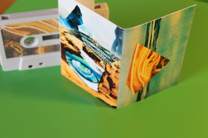
Theme
Steven Ramsey, collage maestro: Civilization building, icy landscapes, streaming. the original title of the photo was “overwhelminginformation.jpg” if that helps.
Process
Byron Christodoulou of Golders Green: The artwork was done by Steven Ramsey and I believe it is was a real collage (not digital). I remember this cause he told me he had to scan the images in order to send them. Steven was kind enough to provide custom collage for the cover and also kind enough to let me use one of his already made collages, which is very popular I would say. (I am talking about the pyramid.)
Collages: Steven Ramsey
SR: Cutting into an image always begins with destruction and ends in a single moment of creation. It takes a few times and sometimes the moment isn’t satisfactory. Stop, listen, cut, take a breath and then let the music build a color, concept, or image. As the founder of Constellation Tatsu, I look for music that is adventurous with spiritual artistic sensibilities. We try to do the same with our artwork/collages. I try to stay away from images that already have a completed vision and look for ones whose concept was originally lost or when taken out of context creates something completely different. Cluttered collages have always bothered me and it only takes a few images to build something unique.
Collaboration
SR: Given the audio, I was free to create whatever came to mind. Open-endedness is a luxury we both have running small cassette-based labels.
BC: I was lucky enough to be able to choose the artist, which turned out to be a great choice. In the same way that Romain was not restricting me in any way music-wise I thought of going the same way for the artwork. While for this particular artwork I decided not to give any instructions, for I trust Steven’s aesthetics, I was able to discuss and choose part of the artwork. Also with Steven there is an ongoing collaboration mostly for his label. I do masterings for him quite often. I had the chance to master some really wonderful and genuine music. Right now he is on the queue for another mastering of a new release,which is pretty awesome as always.

Artwork & Design: View From The Coffin
19. Lento ~ Anxiety Despair Languish
Theme
Donato of Lento: The cover is a detail taken from “The Isenheim Altarpiece” of the XVI° german painter Matthias Grunewald. The whole thing is a huge tryptic originally made by Grunewald for the leprosy hospital in Isenheim, Germany. We were just looking for an image full of pathos and that angel showing that ecstatic expression seemed to perfectly fit with the entire general mood of the record.
Process
D: We just began to search a graphic designer to complete the creative process. View from the Coffin showed an unbelievable commitment for the project. After me and my bandmate Lorenzo spent some days buried in libraries trying to get a good resolution image of the detail we choose, he started with the practical work.
View from the Coffin: The guys of Lento called me asking for my help about album artwork, band logo and merchandise development. They had a really clear idea of how the things should look. So I started working with some particular priorities in my mind – typical colours and procedures properly used in 1500 A.D. Lettering was crucial. I started from the logo and then went to the title working halfway between some certain calligraphic gothic and perfect symmetry. As far as concerning general layout on gatefold and digipack the computer was essential, but the lettering is completely hand-made. I spent hours and hours trying to achieve the best result, and every time they called me to change something I had to start again from the beginning, almost losing my eyes on the drawing board! As I was going further, the result was so fullfilling that I decided to go for a hand-made tracklist as well right before finishing with the merchandise development, including a serigraphic tour poster that is really one of a kind.
D: We had a break after we showed the complete layout to Denovali, because they considered the logo to be too Gothic, thus asking to reduce the lines a bit. That one request has been responsible for a hundred emails between us and View from the Coffin trying to get a balance of what we wanted and what they felt like about the new release. Nice, but a challenging experience.
Collaboration
VFTC: This was indeed the only time I’ve dealt with a whole band. Most of the time you just report to one person only. I was getting emails from every single member about every little thing to be fixed! Once I got the material chosen by the guys at my office I started to work. This is a good chance to say thank you to my fiancee who helped me a lot in the colour correction, and with great professionalism.
Extra
VFTC: Choosing the gold print for the lettering and logos was like the icing on the cake as this is so heavily used by medieval miniaturists. It was like being hurled inside the Abbey Tower of the film “The Name of the Rose”! A special edition of the vinyl using the gold paste was also requested. The support shown by Denovali Records for the use of additional colors deserves a special thank you. This does not happen often! Holding the album is still a beautiful feeling and makes me think about a great band that I already used to listen to even before meeting them. Finding such lovely people and such great musicians to work with has been a pleasure.
Art & Design: Jakob Rehlinger
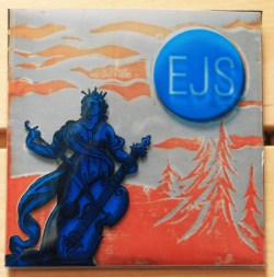
20. EJS ~ Improvisations for Strings & Electronics
Theme
Jakob Rehlinger, Arachnidiscs label head: I’d wanted to do something with multi-layer transparencies for a while and the Espvall/Jakobsons/Szelag CD felt like a great opportunity to explore that. As far as the actual imagery—the woman playing cello in the woods—I have no idea exactly how that came about, but I think it’s evocative of the music. I can’t remember if I came up with the idea of having a picture of a cellist playing in the summer woods under a blue moon who would reveal a skeleton in the snow as you removed the layers first, and searched for a 15th Century engraving that worked, or if the idea came after finding the engraving. Knowing myself, I suspect the latter. The basic concept was definitely inspired by those anatomical multi-layer diagrams in encyclopedias that are printed on transparent sheets and you can peel off layers from the epidermis down to the skeleton.
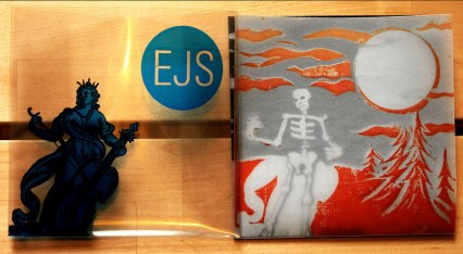
EJS Outer sleeve removed
Process
JR: This project involved a number of different production techniques. The outer sleeve is designed digitally and printed on overhead transparencies on my laser printer, then cut and folded by hand. It shows the 15th Century cello player. The inner envelope is a lino-cut block print (the skeleton under the moon in the woods in the snow). It was cut to match the pose of the 15th Century lass. The in-between semi-transparent vellum layer (showing the summertime trees) is also printed on my laser printer and is a negative image of the lino print with the skeleton masked out. This layer wasn’t originally in the plan but when I assembled a prototype, I realized the skeleton showed through the cello lass too much and I needed a buffer. The inner-inner cardboard CD sleeve was printed by the CD duplicator and is a digital mash-up of my block print and the anonymous 15th century engraving.
Collaboration
JR: I never collaborate with the musicians (except, obviously, when the musician is myself) on the graphics, though I am open to suggestions. I’m insistent that I have carte blanche. Naturally, I do my very best to be respectful of the artist’s music and artistic vision (as I interpret it). But the label is playtime for me and a hobby I completely lose money doing (especially on an elaborate package like the EJS disc) so if I can’t follow my design bliss, there’s no point for me in doing the label at all.
21. Alexander Tucker ~ Third Mouth
Artwork: Alexander Tucker
From Alexander Tucker’s MySpace: I’m also an artist, creating artwork for my album covers and side projects, including ongoing drawings and comic artwork for ‘Sturgeon White Moss‘ (White Moss Press) and the cover for Nordic doom-master Wolfmangler (Aurora Borealis).
Theme
and from Thrill Jockey: Third Mouth is a little bit like therapy for me. It’s about the fact that when I was younger my mum would say she could speak in tongues because spirits were talking through her which used to freak me out. It is also about the idea of having a third mouth instead of a third eye. It was the idea of a voice coming through a person, as if they were a conduit from another world beyond this one.
Unique Cover Portraits: Courtney Cerruti
22. Taskerlands ~ Taskerlands
From the Time Released Sound website: The Taskerlands limited edition, deluxe “chocolate box” version, will be released, as will the other five in this series in a small 3.75″ square, hinge lidded and greatly modified chocolate box, in an edition of 80 copies. Each of the boxes in this particular release will have a unique, hand painted Courtney Cerruti portrait of a woman on the top, along with a small, tacked brass clock. All sides of the box are stamped with cobwebs. The inside of each box will be uniquely collaged with appropriately mysterious 150 year old engravings, and will also contain the music on two 3″ stamped mini discs on hubs…one on the inside of the cover to the box, the other on the thick foil insert that originally came in the box. Atop that will be a mini double sided, printed, informative insert, and beneath it all, at the bottom of the box, will be a sectional container filled with exotic hardwood confetti…no doubt torn from the inside of the notorious “Taskerlands” house, itself…Each Taskerlands box will also come with it’s own antique skeleton key! The bottoms of all these boxes will be clad in felt.
Painting: William Schaff
Layout: Philippe Gerber
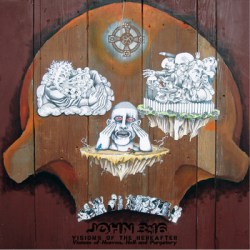
23. John 3:16 ~ Visions of the Hereafter
Theme
William Schaff, artist: Fairly straightforward…versions of Heaven, Hell, and Purgatory.
Process
WS: The piece changed as I worked. I had no plan for it to be as large a piece as it ended up being (roughly 33″ x 35″), or for it to be on wood. But as I was creating it, I wanted to make all three of these locations part of us….people. So I placed them inside the human skull, acting as the eyes, nose and teeth. As our salvation, damnation, and our desire to improve is in all of us, it just kind of made sense to me.
Collaboration
WS: As is often the case when I am working on a project for a band, I have the music playing in the background, often on repeat, so it just keeps going, influencing me and the direction of the piece. I hear this as a beautiful album that offers sweeping vistas, full of people and their lives. So I wanted to show people in the different states of being in Heaven, Hell and Purgatory.

Art & Design: Jakob Rehlinger
24. Moonwood ~ The Strength of the Pack is the Wolf, and the Strength of the Wolf is the Pack
Theme
Jakob Rehlinger of Moonwood: The imagery of the coyote skull is a direct extension of the human skull motif of the last few Moonwood releases and the Kipling/Coleridge-inspired titles from this album. It’s sort of an acknowledgement of the druggy, opium-den mood of the music and the “colonial” nature of a white Westerner exploring these Middle- and Far-East flavors. I love the tones and scales of Eastern music but I am in no way paying homage to those traditions—I’m outright pillaging those sounds. I think, in a way, any Westerner working in this kind of world-psychedelic genre is indulging in musical colonialism. I wanted to be upfront about it in the artwork.
Process
JR: The translucent red outer envelope has a simple lino-cut block print of dramatic, explodey lines coming out of the skull. This means nothing other than LOOK AT THIS! The design works really well on a T-shirt, I found. The original idea was to have some sort of poppy design like is on the inner-sleeve. That didn’t work out and I went with something I thought looked dynamic instead.
Extras
JR: I think it’s really important to have something in the album packaging be handmade. In this day and age of digital downloading (legal or otherwise) you have to make your physical product an objet d’art for people to choose the lowly CD format (shipping costs!) over an MP3. Personally, I always choose a physical product over a download, but I am aware I’m in a dwindling minority of collectors. If you’re only interested in selling music, digital downloads are definitely the way to go. If you’re interested in selling albums, some form of handmade packaging is essential.
Artwork: Maxime Vavasseur, Alvina Von Rhein
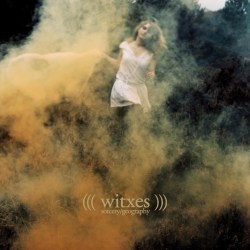
Cover Photograph: Alain Vonck
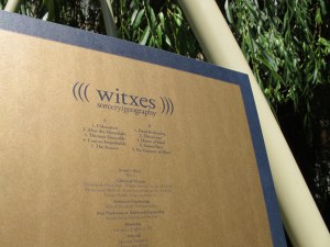
25. Witxes ~ Sorcery/Geography
Theme
Alvina Von Rhein, artist: Maxime first told me about his kind of obsession for maps and geography datas. Combined with the esoteric atmosphere he wanted to give to his project, an idea of the result came in my mind as a soft but singular iconography, almost dark, but full of poetry.
Maxime Vavasseur of Witxes: This album deals with the musical recreation of an inmost geography. It is about how we experience geography, how we superimpose our experience of places we’ve been (or we’re dreaming of) with more scientific datas, the history of these places, what we know about them… In the end, this album, this attempt at expressing these ideas is some sort of sorcery. So I wanted the artwork to be strongly related to the ideas of location, movement, memories, depth, definition and of course sorcery and geography. I needed the imagery to enhance the album’s mythology.
Process
MV: At the very first meeting [with Alvina], she showed this set of photographies by Alain Vonck. I immediately became obsessed by this set, shot for a fictional jewel catalogue, a publication showcasing a designer’s work. I couldn’t get my mind out of these first pictures as they were really conveying the ideas I mentioned earlier. The one we picked has everything: a witch, a location, nature, depth, details both precise and blurry. The picture itself was shot in the far suburbs of Paris. The smoke wasn’t Photoshopped as many people think; they used emergency flares on set to create this eerie reddish fog. We reframed it and after that, everything technical about the layout was Alvina’s work. She would work on fonts/types and every detail and then send me drafts so I could sharpen my ideas about the artwork. She was very patient and I feel she was really working for the artwork itself instead of putting herself or her work upfront, which was very professional. I had precise feelings and ideas and she helped me going through it, giving birth to what I was picturing for my record. She was the perfect midwife.
Witxes vinyl back cover
AVR: Alain Vonck is a great graphic designer and friend of mine who worked on a personal project a few years ago and organized a photoshoot in the woods, which included white-dressed girls, soft light and coloured smoke. With the courtesy of Alain, the picture was then selected. Selecting the right type and sizing and organizing informations for them to be coherent with this meaningful picture was an intensive work. The final object, once printed, has to tell everything you got to know about Maxime’s work before listening to Sorcery/Geography. I want to thank God for giving me every day the strength for taking these kinds of beautiful challenges.
Extras
MV: For the back of the sleeve, I wanted to use colors I had in mind since the beginning of the project: dark blue and a metallic dark gold. I wanted something very simple, with credits up front (I’m a sleeve credits lover). Then we had to work within Humanist Records financial frame, meaning a simple 12″ sleeve. We picked a non-shiny cardboard sleeve because we didn’t want any kind of glossy sleeve to mess up the front cover. In the end, I really love this artwork. It is very simple but efficient. But this is mostly Alain Vonck’s work restaged. We just chose the right picture from the set and dressed it for Sorcery/Geography.
Design & Layout: Alex Hall
26. Lilacs & Champagne ~ Lilacs & Champagne
Theme
Emil Amos of L&C: The initial idea was to make a cover that was from a lost crevice of forgotten genres… representing the kind of record you might see at an estate sale and think it could be an early 70’s dark hippie record, but find out that you were totally wrong when you got home. …something in that ‘Songs of Experience’ Axelrod era when high-concepts were still allowed to infiltrate high-budget/high-musicality situations… maybe like Jean-Claude Vannier’s “L’Enfant Assassin Des Mouches”… something that could come across somewhat formless but insidious.
Process
EA: We actually went through several phases of different names and various concepts before arriving with the final result in the last few weeks of production. But in terms of our roots of sampling and collage: Growing up in the late 80’s/early 90’s in the skateboarding community there was a constantly satirical take on everything in the outside world. Stolen video collage and image appropriation was the norm in the underground. Virtually all skateboard art seemed to make fun of normal people’s lives on every level… as if we were aliens analyzing and laughing at their silly realities. I’ve always seen our record covers as similar to skateboard deck graphics… and we’ve used & abused them with the same kind of slap-dash and vaguely anti-humanist attitude.
Collaboration
EA: Usually for all the Grails/HolySons/L&C covers we often start with elements of collages I’ve made by hand and then Alex re-builds them and lays them out in new ways that accentuate the pointed/imagined message we’d like to convey with the particular group of songs we’re working with at the time. Check out any Grails or HolySons record covers for their constant themes.
27. Grasshopper ~ The Day America Forgot
Artwork: Johannes Schebler
Johannes Schebler: The artwork tries to reflect the general feeling of the sounds: bleak, depressed, sinister. to give the motive a similar mood, an abstract acrylic painting was made, where structures can be interpreted as destroyed ground/area. Furthermore, when you look closer, a face can begin to be recognized and while checking the work under this perception, the structures could be read as a symbol for a distorted/derranged mind. The flag, which was later added in photoshop and covers the eye of the person, works as a connection to the album title.
.
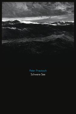
Cover Painting: Frederick Judd Waugh
28. Peter Prautzsch ~ Schwere Sea
Theme
Peter Prautsch: The overall idea was to create a layout for “Schwere See” that would suite a book as much as a record release. I thought of Schwere See as an imaginary story that combines all the elements I found in those books about nineteenth and early twentieth century quests of oceanic and polar explorers.
Process
PP: The cover-painting “The Great Deep” was done by the marine painter Frederick Judd Waugh (1861-940). It’s now part of the collection at the Brooklyn Museum and in the public domain. The limited edition of the release also features historic images from the National Oceanic & Atmospheric Administration (NOAA), Historic Fisheries Collection. I first thought of doing a simple Digipac release but I changed that to a very limited 75 pieces Super Jewel Case in order to have bigger images. I also like the albums to stand out, once again thinking of adding it to the bookshelf rather than the cd collection.
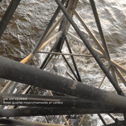
Photography: Mohammed Ashraf
29. Pie Are Squared ~ Three Quarter Moon / Memories et Cetera
Theme
Mohammed Ashraf: I knew that I wanted the artwork to reflect the environment in which the album was created and this album was made entirely in during one long offshore hitch. I think this is something that I always want to achieve with my album art: to have it directly related to the music or the environment in which the music was born.
Process
MA: Since I had no access to any visual artists who would be stuck in similar circumstances (on an oil rig), I had to basically do it myself, which wasn’t very easy since I have very limited photography/photoshop skills. This, however, did make sense given that I released the album with minimal mixing and without even mastering it to keep it as rugged and raw sounding as possible as a nod to the places in which it was conceived. I wanted the cover to be interesting yet very simple and under-processed. It’s basically a snapshot of where I was and where the music was brought to life.
30. Ryonkt ~ Troposphere
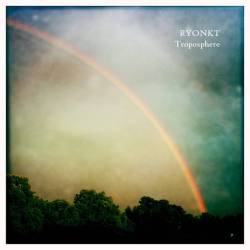
Photography: Antony Harrison
Design: Gavin Catling and team
Theme
Gavin Catling, Twice Removed Records: According to Wikipedia Troposphere “is the lowest portion of Earth’s atmosphere” and “the word troposphere derives from the Greek: tropos for “turning” or “mixing,” reflecting the fact that turbulent mixing plays an important role in the troposphere’s structure and behavior.” The idea was to find artwork that covered both the environmental part and also the turning and mixing part that is conveyed in the music.
Process
GC: Ryo was very open about the process of the album and left the decision about the cover and mastering with the label. I am a fan of Antony Harrison’s work as Kontinnent, Arev Konn and Paco Sala and had been in contact with him since I had interviewed him for my old blog. I was aware he was also a great photographer via his Flickr page (and now through Instagram) with various styles and themes. I got in contact with Antony to gain permission to use one of his photo’s for the cover art and then collaborated with my wife on the typography and layout. Antony offered to send a high res copy of the photo, but I ended up using an image straight from the Flickr page and whether that made the image of lower quality I am not sure, but I like the grittiness of the image and the variety of colours in it.
I am happy that people have appreciated the cover (and album), but the credit must go to Ryo and Antony with thanks to my wife for her input.
Honorable Mentions
31. Black Elk ~ Sparks
32. Offthesky and Man Watching the Stars ~ Afar, Farewell
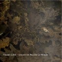
33. Flavien Gillie ~ Encore un peu de ce monde
.
.
.
.
.
\
..
34. Brambles ~ Charcoal
35. Sigur Rós ~ Valtari
Pirate Ship Quintet ~ Rope For No-Hopers
.
.
.
.
.
Nayt Keane
Thank you to all the artists, label folk and contributors from around the world for helping to make this article so insightful.

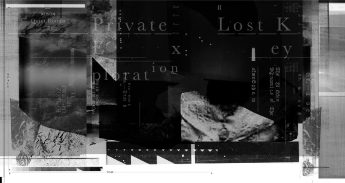
I see bvdub’s Serenity in the photo collage but mentioned nowhere in the list. Great list nevertheless 🙂
Thanks! Every cover that the staff members voted for is found in the collage, even those that did not make the overall list. So at least one staff person loved that cover as well.
Pingback: Year’s Best Album Covers | Palacmusic
Pingback: Best album covers of 2012: Ana Never is in the ACL’s selection | Fluttery Records
Pingback: Best and Worst Album Covers – 2012 – An Overview | Album Cover Hall of Fame Site
Pingback: Megrez – Nite Lite