
Album covers are a funny thing. Some take months of planning and fine tuning while others spring up in the spur of the moment with no editing required. This year’s crop of covers features this spectrum of approaches, but, as will be seen below, many are done by the musicians or with a small, focused team. And three of the top five covers utilize the music’s location for inspiration.
 1. 36 ~ Dream Tempest
Photography, design: Dennis Huddleston
Theme
Dennis Huddleston: When I’m designing artwork, I rarely have an explicit image in mind and I prefer to let the design progress naturally, organically, from start to end. It’s the same with my music really; I never sit down and say “I’m going to use these exact chords/notes!” or anything like that. It’s spontaneous and without any real goal. It’s the pleasure of creating something from nothing, without any predefined rules or expectations, which usually results in something interesting.
Process
DH: Dream Tempest is the first album where I made only a single piece of artwork that I was immediately happy with and used for the final design. Normally, I go through about 5 or 6 different concepts/ideas and choose the one which I find works best, so it was a nice change of pace to finally nail an idea in the first try! I knew I wanted to work with similar, amorphous, abstract-style imagery as I have in my past works, and in my head, I initially saw bright, heavily contrasted colours.. and spirals! Loads of spirals! In the end, I used everything from steam, paint, foam, water colours, fabric: a wild Smörgåsbord of colour and form, collaged together, to hopefully make something beautiful and unique to complement the music.
Extras
DH: I did a slightly modified version of the artwork for the vinyl edition, as a special thanks to the people who ordered it. I also printed the names of every single person who ordered the record on the inside-sleeve of the vinyl gatefold, to show how appreciative I am for their support. I’m grateful to every single person who listened to the album, left a nice comment/email and supported the release, so it’s nice to give something back.
 2. Ian William Craig ~ A Turn of Breath
Photography, printing: Ian William Craig
Theme
Ian William Craig: A Turn of Breath was as much about the sense of the space it was recorded in as it was about the pieces themselves. As a visual artist as well, the question of space has always been a hugely generative one for me. I wanted the space to be a part of the visuals as well – and so because most of the album was recorded in the printmaking studio where I work, I thought it would be fitting to use some imagery from around the studio. We recently built a brand new facility that we have since moved into, but at the time I recorded A Turn of Breath we were still over in the old place. It was a studio inside an old converted hospital from the ’30s and was as such in a state of rather accelerated disrepair. Lots of stories in the hallways and a very eerie feeling if you were ever there late at night.
Process
IWC: There is a technique called a dégradé which we use in relief printing, which is basically rolling out a large flat of gradated colour with either a brayer or a roller that would then get transferred over to a plate – such as a woodcut or a lino cut – for printing. I had a student who was especially good at them and said that since we were moving anyways, I wouldn’t be upset if one such dégradé ended up on the wall. And so it was that the wall of the studio got covered in the things. The photograph on the front of the album and on the insert is one of these – the negative of one actually – in homage to the place the album was recorded in. As well, though I don’t printmake as my main form of expression anymore, the printmaking process plays so heavily into the way that I compose and create music (for example, the use of layering, texture, or antiquated machinery) that having the studio be both on the cover and in the recording was important to me. Our new place is nice but lacks the grit and the character of the old one, but hopefully some of that character is captured in the album!
 3. Fennesz ~ Bécs
Photography & design: Tina Frank
Theme
Tina Frank: Christian [Fennesz] has made several albums that are conceptually concentrated on a specific location (think Venice or Black Sea). Bécs, which is Hungarian for Vienna, is an album connected to the city we now both live in. When Christian asked me to do his cover we listened to the first finished tracks, which felt dark but warm and I had scenes of a retro-futuristic, dark city in my head.
The Austrian national train service company is building a new main train station in Vienna, and will be fully operational by December 2015. If you come by bus or train from the east this is the first spot you encounter in Vienna. The area surrounding the new station is also a big construction site for the city, as they are building a vast new neighborhood with housing for many people, new concepts of schools and education; a bank is building their new headquarters, a big tower full of information technology is looming in the back. It will become a new urban center with a combination of working, living, and will be Vienna’s main place of arriving and leaving. When I went there last December and January to look for images it connected many different topics: from the muds of this vast unfinished construction site to the hopes of a new area. It connected the future and the past, like a science fiction movie from the 1980s.
Process
TF: In the beginning I had wanted to go shooting images with an old black & white movie camera from the 1950s, but then things got way too complicated to also learn how to use this machine. One day I was around the area early December. It was a grey winter’s day on the brim of becoming night. It was very foggy and the area looked totally spacey. Unfortunately I didn’t have my camera with me. So I waited several days, then some weeks, but it never became like that again. In the meantime I went there several times and took many great images, but none fit the music – they were too real, they were missing this spacey feeling. In the end I took one of my shots, deconstructed it with glitch technology, cut it apart in several pieces and reconstructed it by placing the parts into a spaceship-like tower complex and photographing these parts.

øjeRum ~ There is a flaw in my iris – – – These three collages center around different kinds of defacements – they’re about memories and how memories dissolve and obscure the things (faces) we remember. The Last Eye (center) is named so because no matter how obscured a portrait is you always seem to keep looking for recognizable features, like the eyes. Also named so because of a thought I had about the last human being closing his eyes for the last time and how there would be no one to witness this.
4. A Giant Fern ~ September Crop tape series
Collages: Paw Grabowski
This is the first time we’ve featured both multiple covers for the same album as well as multiple albums as a part of a series. The strength in design and unified themes makes this particular series stand out. It only takes one look to recognize the quality of the work. All of the specifics under each of the images are Paw Grabowski’s comments.
Collaboration
Carlos Costa (A Giant Fern label founder): The unequivocal decision to use Paw Grabowski’s collages for the batch was made the moment I put my eyes on his portfolio online. It was strikingly impressive; the amount and variety of those carefully elaborated images displayed click after click, as if an unearthly dream was passing before my eyes. After revealing to Justin Wiggan a pre selection of three images I made for his tape in collaboration with Charles Barabé, he immediately suggested the idea of using them all. For a moment I felt nervous because I surely didn’t want to abuse Paw’s generosity in lending his work for a group of tapes,but he kindly agreed.

Micromelancolié ~ Ensemble Faux Pas – – – These three collages all center around female faces – all displaying some kind of distress.
Process
Paw Grabovski: All my collages are handmade. I only use original clippings from old books, newspapers and the like. No computers and no printing are used in the making. When a collage is done I scan it to use for the web, for prints or for cover art.
CC: Curiously the process of selection became easier after that moment because the necessity of narrowing down the selection was suddenly relieved, but also because Paw’s work seems to be clearly elaborated in series. Many of the images share the same themes, colours or compositions.

The Hidden Persuaders ~ The Bone Forest – – – These were all made in 2014. They are among the darkest and bleakest of my collages. These are probably among the most poetic of my collages.
Taking my impressions of the music that was to be released, my personal suggestions of imagery for each set of tapes was almost instinctive, but each artist had the opportunity to make his own decisions of what he though would fit best his own music. Basically I chose the images for the Roadside Picnic & Charles Barabé and Micromelancolié tapes. Andreas Brandal of Hidden Persuaders had his own take and undoubtedly chose the darkest ones and obviously Paw who had an intimate perception of what would be best, likewise made his own choice.
What was really exciting was the fact that when an artwork is commissioned to an artist, generally there is always two or three alternatives to choose from. In this case the possibilities seemed almost endless, like a child in a huge candy store, and this was indeed a privilege.

Roadside Picnic & Charles Barabé ~ Worn paths in crown dust – – – These all look kind of sculptural and deal with a sort of dream state or the state between wakefulness and sleep.
I took the task of designing the most minimal layout possible in order to enhance the collages, and because the majority had a vertical display, the solution of creating a margin around was agreed between me and Paw. Just to keep some sort of innocuous but referential information, the catalogue number was placed on the cover
5. Plinth ~ Wintersongs
Linocut: Sarah Tanat-Jones
Theme
Michael Tanner (Plinth): I gave Sarah carte blanche to run with her own thoughts as regards to the imagery after seeing her wonderful linocuts of Gypsy caravans, vaguely intimating that I’d appreciate something in that general ballpark. I certainly didn’t expect the stunning results she achieved. I was in the process of moving to Sussex, an area with which Sarah is well acquainted, so I was familiar with the undulating lines of Ravilious and Eric Gill – All these ingredients seem to factor into the final cover image.
 Sarah Tanat-Jones: Richard and I, who run Kit Records together, knew straightaway that it ought to have a stark, hand-hewn look – organic and simple. This suited the style of music. We didn’t have a huge budget, so we got thinking about how to create something beautiful, for not a lot of money. I’d studied printmaking as part of my illustration degree, and I’d made linocuts, which I’d really enjoyed and had taken to instantly. So we decided to use lino.
Winter songs being what they are, we thought we’d make use of white space to depict snow. So the negative space is very important. The black lines and printed texture give the perfect look to the wintery landscape. We’re from Sussex, which has rolling hills and natural flint everywhere, and the typical Sussex flint barn went into the cover design. I’m always inspired by some of my favourite artists like Edward Bawden and Eric Ravilious to give a sense of English craftsmanship. I also wanted the hedgerow to look almost like runes, to suggest timelessness and folk history.
 Process
STJ: With lino, you can make a great number of copies, with very simple technology – just a simple printing press. There’s also a handmade look to the work, as you’re carefully carving and cutting yourself, no machinery or digital tools at all. We searched around for a cheap printing space – which is really hard to find in London! We finally found an amazing studio tucked away in a corner of Walthamstow. We headed there each day for a week to print the work by hand. The owner just left us to it, unless we asked her a question, and then she grumpily advised us. She was awesome.
The materials were simple: lino and ink, and a big old mid-century press. We got ink on our fingers and all over our aprons. We had tea in the 1920s Italian cafe across the road, which had all its original tile and mirrorwork, and a freezing outside loo.
The biggest challenge for me was carving the words for the verso side. You have to carve backwards because the print is made in reverse, so you’ve got to be careful that it’s neat and easy to read. And it was really delicate work. I’m so glad my fingers didn’t slip. I also really liked the idea we had, to make bird tracks going around the round vinyl label.
Collaboration
MT: My own relationship with that album is fairly ambiguous and ill-defined. It’s like a teenage diary occasionally being read in public, all the cosmetic flaws in situ. I know I can’t go back and rework it. Things in there sound painfully naive, although I’ve enough separation from my 21 year old self to almost begin appreciating that. This agitation led me to simply turn it over to Richard and Sarah with no real instructions. I printed the original cassette sleeve on my home printer from basic clip art, made the linocut that graced the first 2001 CDr at my work-desk….the Rusted Rail edition was packaged and designed solely by the label owner without my input. So I never really had a staid framework of imagery in my head for Wintersongs, it has been constantly re-evaluated, re-interpreted. I have to say the Kit version is my favourite, by a long chalk.
Extras
STJ: At Kit Records, a big priority is to create releases with unique artwork. We’ve created prints, posters, folded concertina booklets and zines to go with the music. We think that makes an impact on how people consume the music we release, and gives in a special dimension in an age of digital content consumption. I suppose every independent label and musician is thinking of ways to make their work stand out in a sea of pixels. Having something to hold and keep is still special, and especially if that object has been individually printed by hand. Wintersongs came with a double-sided printed cover, and each one was unique. The printing process means that the ink is spread slightly differently each time, and it was lovely to see these ink shapes and textures being formed. It also has bird’s footprints on the inner circle, also individually printed by hand.

6. Óbó ~ Innhverfi
Drawings, collage: Ingibjörg Birgisdóttir
Theme
Óbó: I was immediately drawn to Inga’s work, not only by it’s rich texture and beauty but mainly because of the big hole she superimposed in the nature. To me, it suggested something hidden underneath all this beauty. Although we spend to our lives in such proximity to this nothingness underneath our feet, it remains hidden from us but we can still sense its immense silent but dramatic power.
Process
Ingibjörg Birgisdóttir: My starting point was the music (which I fell in love with) and the title Innhverfi (Internalized or inside/out). I made some mirrored drawings that weren’t just mirrored but a little distorted and contrasted. I made the front cover image by mixing together old postcards, photographs and drawings to make a landscape that would show both the innocent and beautiful surface and the hidden and mysterious abyss. I thought it fitted very well as the music is so layered and filled with details and contrasting elements. It sometimes suggests something totally different than is going on. I also wanted the artwork to be kind of quiet, but at the same time dramatic.
.
 7. Richard Pinhas and Yoshida Tatsuya ~ Welcome In The Void
Design & Illustration: Yann Legendre
Theme
Yann Legendre: Richard Pinhas is my friend and we share a passion for Science Fiction – in music, literature and art. Besides our friendship, I have designed and illustrated all of his album covers since 2006. And since then, each cover is an allegory and an exploration of a futuristic world. Even if each album cover is really different, they are all related to each other in a certain way, as the music is.
Process
YL: We always start talking in a café, or in a movie theater. Then we listen to the music of the upcoming album and discuss it and finally the title comes. It becomes a landmark for me to start thinking of the potential imagery. The next step will be for me to show Richard a very rough sketch of the cover, along with the explanation of how I see the illustration, colors, and typography. For this particular album, since it was a duo, I wanted the 2 faces (profiles) to make one, and then I composed a kind of spaceship head.
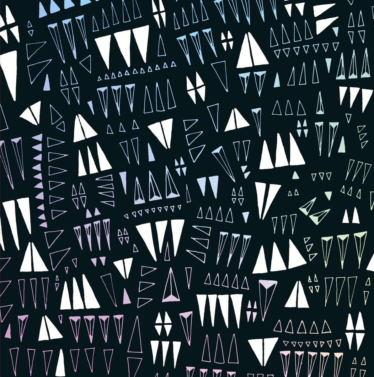 8. Tranquility Tapes Label focus
All artwork: Caroline Teagle
All the covers for the Tranquility label are striking, but when put together they achieve momentous synergy of form and ideas. This label has been consistent in presentation and vibrancy for many years. Just check out their catalogue to see all the covers over the years!
Theme
Caroline Teagle: Organic abstraction. Sometimes it’s based on geometry, other times single celled organisms. There are no rules other than to evoke the spirit of the label and the music. Most of the time that means non-representational imagery. The kind of things you see when you close your eyes.
Process
CT: It is at times painstaking process that starts on a pad of paper and ends in Adobe Illustrator. I can spend hours on one cassette drawing tiny dots and lines. I try to just let myself go and be loose with it. Often I’ll start over if something doesn’t feel right. It’s all just impulse and intuition.

Collaboration
Franklin Teagle (Tranquility Tapes): In the sense that all of Caroline’s artwork is directly inspired by the sounds created by the artists for each tape, all of the covers are collaborations. She’s created all of the visuals on her own, though. I have very little say, and one of the most enjoyable parts of running the label is seeing what designs she comes back with for each new batch. The Rain Drinkers tape we released this year did use a photograph by Dani Schafer as the basis for the overall piece. Nearly all of the band’s previous releases featured a striking photograph of the duo, so I thought it would be fun to combine that established style with the label’s. Caroline did a great job melding the two, so it doesn’t look out of place sitting next to the rest of your Rain Drinkers tapes or with the rest of your Tranquility Tapes.
Extras
FT: As much as I love tapes that come with antique photographs, handwritten inserts, seeds to plant in the ground, etc., we like to keep Tranquility Tapes simple and streamlined. As of this year we started including a slip of paper with a Bandcamp download code, but my hope is that you’ll toss that out once you’ve downloaded the release because it’s ugly.
 9. BBS ~ Coltre/Manto
Painting: Uwe Behrens
Collaboration and Process
Dimi, Midira Records: The artwork is by the Berlin-based artist Uwe Behrens. He is a friend of the band and the band is a fan of his works. So Aidan Baker, Erik Knive Skodvin and Andrea Belfi talked with him about using one of his paintings, and they found this one. This is the original painting. It was made before the music.
We started discussing with the band which parts of the painting could work for the artwork. As you might have seen, I am no friend of artworks with text on it, so I suggested to leave out the upper part with the text. Erik Skodvin, also a label owner and art director for Miasmah Records, wanted to adopt the job of creating the artwork for the record, so he edited the high resolution photo of the painting to its now-known form and me and the other band members where satisfied with the result.
 10. Rumour Cubes ~ Appearances of Collections
Photography: Jay Malhotra, Original sculpture: Thomas Kilpper
Theme
Terry Murphy (Rumour Cubes): We wanted the artwork to be photography-led and felt Appearances of Collections needed to be markedly different [from the previous record The Narrow State]. For me, this record is positive, it’s full of brightness, colour, playfulness and space, and I was really keen on the artwork reflecting that. We also wanted to raid our own photo albums for the imagery. When Jay showed us the photo he took of MEGAfon, an artwork by Thomas Kilpper which Jay visited on a trip to Berlin, it really resonated, and we felt like we had the perfect image.
While we were trying to find out more about the artist and about MEGAfon, Jay came across a description on his blog which was really interesting. He talks about the sculpture being created in the tradition of Speakers’ Corner, and how it raises the question of who should speak in our society, both politically and simply for ourselves – even the location of the sculpture is a nod to historical, political demonstrations that have taken place there. This idea of speaking out and speaking up is something that definitely resonates with the band. Even though most of our songs don’t have words, we definitely see them as having narratives and a voice that ‘speaks up’ and reflects our views – even if what we want to say is implicit, not explicit.
 Process
Jay Malhotra (Rumour Cubes): I was in Berlin and just happened to pass by MEGAfon whilst I was walking through the city. It was on display outside Volksbühne Theatre. I just liked the colours and scale (each colour is a whole panel from a car) so after trying my hand shouting through it I took a few pictures of the piece and thankfully, at one point, forgot to wind the film, which is how we ended up with the layered effect on the cover.
TM: When Jay took the cover photo he used a double exposure, and Hannah took this effect and echoed it in other parts of the front and back covers, using overlays to create this gauze-like effect. We probably went a little bit too far at one point in the design process and we did tone it down for the final version, but it extends across into the inside panel (the out-of-focus modern building) and neatly ties the different images together.
JM: For me the mixture of the analogue process (film, double exposure) and the digital manipulation in Photoshop is analogous to a lot of work we did on the production of the album as well as how we work as a band in general – using traditional acoustic instruments all the way through to software instruments that our guitarist Adam programs and controls with a computer joystick.
 11. Lawrence English + Stephen Vitiello ~ Fable
Photography: Lawrence English
Theme
Lawrence English: The photo we chose was very much a reference to the idea of “Fable,” this notion of the aged and the worn. Like a myth, they gather colour and richness through ageing and being in the world.
Process
LE: The original image was shot on a Golden Half camera. It’s a toy camera, but due to the plastic lens it gets an amazing and individual distortion at the top and bottom of the image. I liked the way this suggested a sense of coming into focus, which was very much the process that this record undertook.
Extras
Yann Novak, Dragon’s Eye Recordings: Dragon’s Eye has used a consistent packaging template since I relaunched it in 2005. This is the 4th iteration and I think the cleanest and most transparent. There are two reason i chose this path, the first simply being that I did not want to show any favoritism to any one release so no matter how well known or emerging an artist was, they all get offered the same opportunity. The other reasoning was to tie what otherwise would be a very wide range of artists and styles together from Marc Manning’s guitar drones and noise, to Wyndel Hunts digital noise, to Corey Fuller’s electroacoustics, to my own field recording work etc. I wanted the packaging to create a through line to connect what some might not see as related work, but I always did.
12. The Silver Mt. Zion Memorial Orchestra ~ Fuck Off Get Free We Pour Light On Everything
13. Koloto ~Mechanica EP ~ Pen and marker drawing: Cathy McMurray


14. Horla ~ Orogenèse
Art direction: Pierre Torrell
Theme
Le Cabanon Records: The visual concept of Le Cabanon Records first EP series is to create original artwork for each individual artist based on a strict graphic chart, elaborated by the artistic direction of Pierre Torrell, co-owner of the label. For Bruma and Horla, the photography of their EPs was created in specific places directly related to the artists and in their presence. The exterior colors of the vinyls are picked with three simple criteria ; the desires of the artists, the coherence of the propositions in tune with the sonic production, and the panel of colors that can be found in natural materials or man-made.
Process
LCR: The photography is created with a hand-made pinhole, usually a sugar box transformed for the occasion. The idea of a pinhole camera allows the artist to be part of the creative process of the artwork. We often invite the artists to capture their own point of view allowing a dynamic exchange between the musicians and the visual artist. Starting with our second release, we have decided to invite different artists of various horizons to produce an object dedicated to music in addition to the vinyl. Horla’s vinyl was accompanied by a story written by Matthieu Haberard related to the way he listened to Horla’s music, emotionally. The next addition will be a map to find something related to the artist(s) landscape(s). Vinyl cardboards are printed in Ukraine, paper is cut and folded in France. The first release was printed in France by screen-printed process on the inner side.
Collaboration
LCR: The main idea is that their productions have their own language and visual identity. The artwork ables the enhancement of the musical language through a complete collaboration between the visual artist and the musicians. The goal of the label is to promote contemporary projects, through a sonic landscape that our artists provide. Just like the music that Le Cabanon Records offers, we do not want to lay out an easy solution to the appreciation of experimental music but an invitation to attract the curiosity of the auditors and the implication to receive the sonic information of our EP’s.
 15. Tape ~ Casino
Collage art: Klas Augustsson
Theme
Klas Augustsson: I have been doing the collages for the Tape albums for more than ten years, so by now there is a lot of intuition involved. I wanted to do something with an otherworldly or uncanny feel to it, something that didn’t go too easy with the music (e.g. like a beautiful scene from nature) but rather went in another direction.
Process
KA: The central engraving, with the three medieval-looking fellows trying to hold off a demon intruder, was found in an obscure publication from the 1850s. It was only a couple of pages long, in Swedish, with no name of the author stated. The background was taken from another book and shows the interior of a Scandinavian renaissance castle.
The persons have been rearranged and resized, more smoke has been added as well as colour, including subtle colour variations to the black and white. The handwriting is on every Häpna album. To me, the brave fellows kind of looked like the guys in Tape – and I may also have enhanced that impression a little bit…
16. Ben Jacov ~ Transalp
Design: Benjamin Asher
Theme
Henrik Jacobsen, Doumen Records: Mountains. An abstraction of The Alps. Simplicity. The Doumen Records Logo. The mountains symbolize memories of the Alps and their ever changing nature. Memory is a thing that is hard to grab; it constantly morphs from one thing into another. So that was part of the autobiographic topic of the record itself, and we wanted to transport it with the artwork, too.
Process
HJ: We tried different things, and it wasn’t clear until the final print if it would work nicely. Everybody involved was quite busy at the time. The graphic designer chose different thicknessess of the lines of the PVC Sleeve, so that was one thing we had to play around with. Then also there was the choice of whether it should be one-sided or two-sided. How simple shall it be and how much stuff can you put into it, without losing the beauty of a very simple effect? All interesting questions, Benjamin worked on for quite a while I think.
Collaboration
HJ: The designer is a close friend of the musician and they developed the idea together. And then [together with] the label head (me) we discussed the new stages and he changed things accordingly, if he liked what we said.
 Extra
Extra
HJ: It is a standard screen printed sleeve, black on white ground. And then there is an outer PVC sleeve with black lines on it, the rest of it is transparent. So this is how you get this nice and simple Moiré effect.
17. Olan Mill & Keung Mandelbrot ~ Seismology
Artwork: Holger Lippmann
From the artist’s website: Holger Lippmann describes a part of his work as digital painting. What distinguishes digital painting from traditional painting on canvas or paper? We need to distinguish between two categories of digital painting. The first includes works created on the computer with ready-made graphic tools like virtual paint brushes or pens, in something like the way that non-digital pictures are created on paper or canvas. David Hockney’s painting of a sunflower on an i-pad is an example of this. The second category includes works using computer generation, in which programs coded by the artist continually produce new aesthetic concepts as images or animations. Every execution of the software creates new works within the pre-defined boundaries of the system. This process can be called generative painting.
 18. Heinali ~ Music to Sleep Under Snow
Photography: Sasha Naselenko
Theme
Heinali: The cover should’ve brought together all three compositions of “Music To Sleep Under Snow”. [The title track] featured snow as a theme (though indirectly). “Clouds” is quite obvious. The third one, “A Handful of Snowflakes,” dealt with the poetry of water. All three can be understood as either (or both) literal or allegorical.
Process
Heinali: The creative process was fairly simple. I have a friend in Odessa (Ukraine), Sasha Naselenko, who is a photographer and whose works I use quite often as a covers for my releases. My typical process in this case would be just sitting down going through his portfolio for a couple of hours looking for works that would fit. Most of the times I’ll find a couple of photos that, in my opinion, would work particularly well. I’d spend some time with a photo editor to compose a couple of versions with text and choose the best one. I’m not a designer or photographer, so I just experiment with things until I like what I see.
 19. Audrey Fall ~ Mitau
Photography: Kevin Russ
Jurģis Narvils (Audrey Fall): We wanted the album cover to represent our music as accurately as possible, and it had to be timeless. The picture was taken by Kevin Russ. He is an amazing photographer. He travels the world taking pictures and sells them as prints, quite an amazing way to live. All we did was add text in the most neutral way possible, so it wouldn’t distract from the image itself and wouldn’t add any other character to it, staying as pure as possible. And we do make/design everything ourselves, so there wasn’t anybody from the outside involved, except for the picture of course.
 20. Maxime Corbeil-Perron ~ K A T H A R S I S
Painting: Einst dem Grau der Nacht enttaucht (1918), Paul Klee
Theme
Maxime Corbeil-Perron: The art provides the first impression and as such is a major part of the presentation. Other than the fact that it is an amazing piece of art, the selection of Paul Klee refers to his very “musical” approach to painting. My sound work is very much plastic, and often inspired, by abstract pieces of art such as this one. I think one can find the same notions of space, timbre, rhythm and harmony in painting as in music. Paul Klee’s work related strongly to music, and I feel that composing strongly relates to painting, especially in this kind of work. Also, the title of the closing piece “Wise Constellations”, was taken from a poem he wrote in relation to this painting….which to me seems to refer the inexplicable feeling one can have creating abstract pieces of art, and in this case felt that it connected very closely to the context of creation of the last piece of this album.
Release page/purchase link (Review in January)
Nayt Keane: Thank you to all the artists, label folk and contributors from around the world for helping to make this continuing series so insightful.

Pingback: Album covers |
Pingback: Best And Worst Album Cover Art Lists – 2014 – Summary And Analysis | Album Cover Hall of Fame.com
Pingback: Crypto Tropic ~ S/T | a closer listen
Reblogged this on Oregon Skeleton Cowboy and commented:
This is an amazing read